Many organizations fall in the trap of thinking that a rebranding initiative is all about the logo. But, the truth is that a successful rebrand involves a company's vision, mission, internal and external culture and messaging, and more.
You would think that small businesses are the ones that fall in this trap, but you would be surprised to know that, despite their massive marketing budgets, big corporations have been a victim of their own game more than once.
So, without any more preamble, here are what we consider the top 5 biggest rebrand failures:
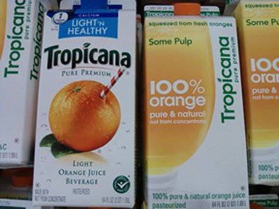
Messing with a classic brand has its price, even if you have the best intentions. In the case of Tropicana, all PepsiCo was trying to do was to refresh the product's image and bring it to the the 21st century. But it seems that their market research was altered or they completely overlooked the results. Once they launched the rebranded product, the consumers backlashed powerfully. The New York Times reported that "some of those commenting described the new packaging as “ugly” or “stupid,” and resembling “a generic bargain brand” or a “store brand.""
In less than a month, PepsiCo decided to pull out the new package design and go back to the classic look.
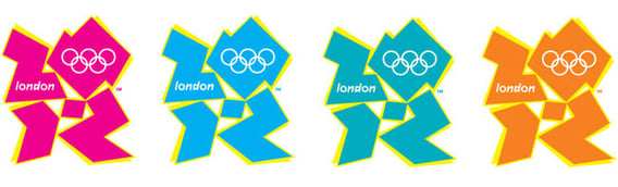 The Olympic games have always given designers some sort of experimentation leash. But, the organizers of London 2012 wanted to create a logo that "is simple, distinct, bold and buzzing with energy.... It feels young in spirit... Not afraid to shake things up, to challenge the accepted. To change things."
The Olympic Commitee had a full market research and brand involvement/education team collecting data and informing people about the brand. But, even with all this, the brand was met with resounding disapproval, and even hostility. ABC News reported that the logo was $800,000, and for the price, some said things such as: "My children could come up with a better design for a lot less money."
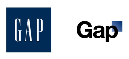
Christmas 2010, GAP decided to scratch their 20-year logo and launch, without warning, a new brand. After much internet boycotting, GAP stated that their new logo design was the first stage of a crowd sourcing process, one more thing that proves again why you shouldn’t crowd source your design projects. The change was such a disaster that in only 6 days GAP decided to pull out the new logo and go back to the old brand.
The Gap rebrand was estimated to have cost them $100 million. Not worth something that could have been done using Microsoft Word.
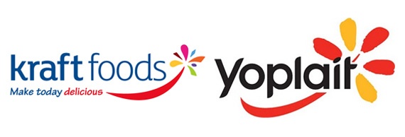
Why would you radically change a classic brand such as Kraft? In 2009, Kraft Foods Group, Inc. changed to a new logo that replaced their iconic red shape with the blue Kraft inside with a new a completely different brand. This baffled consumers everywhere.
Even though the new logo was sleeker, and more modern looking, It just looked like the old Kraft and the new Kraft Foods are totally different companies with totally different products offered. Plus, if you see other brands in the market, the new logo looks terribly similar to the Yoplait logo.
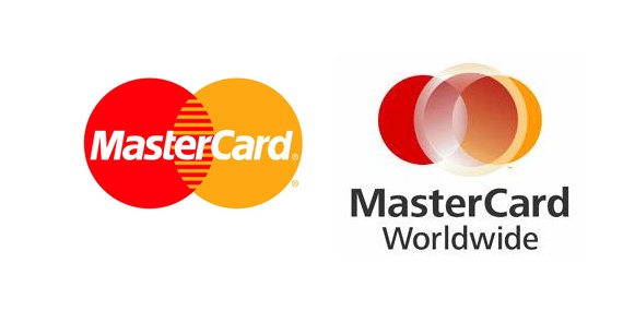
MasterCard introduced a new logo and name in 2006. It is now MasterCard Worldwide. Their iconic interlocking circles are replaced by three circles, with the one in the center having a very primitive gradient. The logo tries to look modern, but there is too much happening with the shapes and all the different colors. Plus, why is the third circle, the one on top, off center? #RebrandFail
A successful rebranding strategy will influence and alter the behavior of your target market's expectations in a positive way. Updating your brand doesn't mean you are a different company, but it does need to reflect your new vision without affecting your core business history. Remember that rebranding is not just changing a logo.


%20(1)%20(1).jpg)