Logos are oftentimes the first impression that your brand makes to the public eye, which makes them very important since first impressions are difficult to forget. Below you will find 27 logo design fails that will make you cringe, laugh and cry all at the same time! I hope you enjoy viewing them as much as I enjoyed finding them!
Logo Fail #1: The Computer Doctors

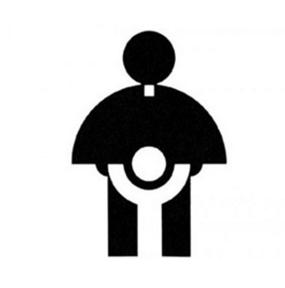
Logo Fail #2: Catholic Church Archdiocesan Youth Commission

Logo Fail #3: Megaflicks

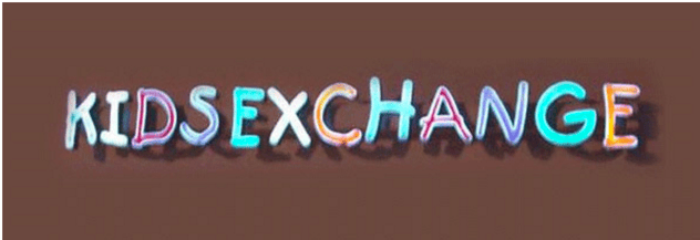
Logo Fail #4: Kids Exchange

Logo Fail #5: Locum Paper

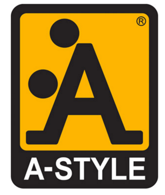
Logo Fail #6: A-Style Clothing

Logo Fail #7: Bureau of Health Promotion, Taiwan

Logo Fail #8: Catwear

Logo Fail #9: Vermont Maple Syrup

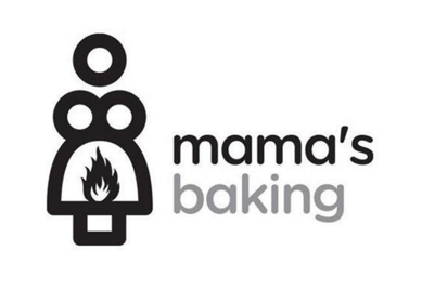
Logo Fail #10: Mama's Baking

Logo Fail #11: Cover the Earth in Blood?

Logo Fail #12: Arlington Pediatric Center

Looking at rebranding your company? Hopefully your new logo will not end up on the "worst logos ever" list! Click the link below for a comprehensive checklist on where to get started in your rebrand!

Logo Fail #13: The Field Center for Research

Logo Fail #14: Encebe

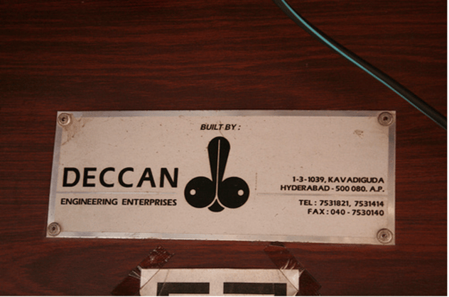
Logo Fail #15: Deccan

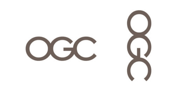
Logo Fail #16: Office of Government Commerce

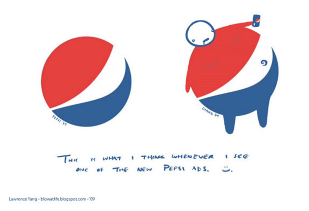
Logo Fail #17: Pepsi

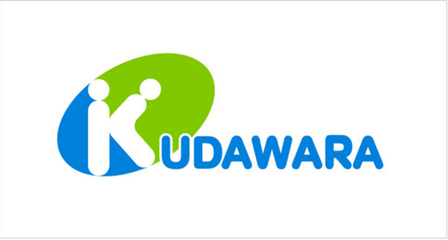
Logo Fail #18: Kudawara

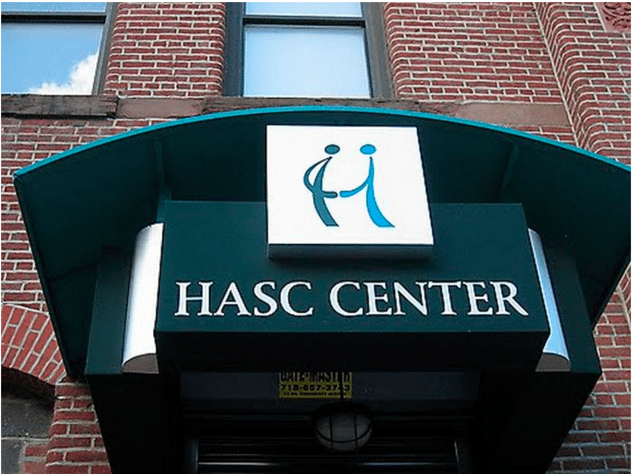
Logo Fail #19: Hasc Center

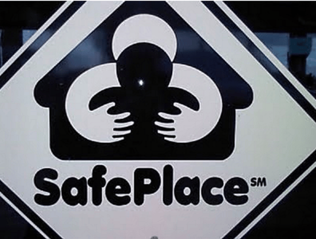
Logo Fail #20: SafePlace

Logo Fail #21: Mont-Sat

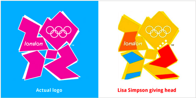
Logo Fail #22: London Olympics

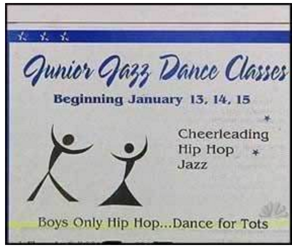
Logo Fail #23: Junior Jazz Dance Classes
(2 juniors dancing or a female body?)

Logo Fail #24: Kostelecke Uzeniny Sausages

Logo Fail #25: Instituto de Estudos Orientais Brazil

Logo Fail #26: Exchange

Logo Fail #27: Fully Erect

CONCLUSION:
Make sure, while in the design or rebrand process, to show your logo to some people that have not been involved in the design. They might see things that did not catch your eye during the process. Of course there is always a time and a place for humor in some logos!
Looking at rebranding your company? Hopefully your new logo will not end up on the "worst logos ever" list! Click the link below for a comprehensive checklist on where to get started in your rebrand!


