Cutting-Edge Marketing to Grow Your Business.
Billboards are a very unique form of advertising because you literally have the attention of the viewer for a split second. Clients love to pack in as much information as possible in the massive sign, and it is our duty as effective marketers to deter them. This usually proves to be a challenging task! Below are 9 billboards gone wrong and what the bad ingredient is.
Is this billboard about going to the beach? Buying an umbrella? No! It is trying to convince you to use their banking services. Unfortunately their Unique Selling Points are secondary in this billboard design. 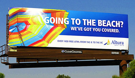
Unfortunately we do not have complete control of this. We know where the billboard will be placed but we do not know what billboard design will be going in next to ours. The only thing I can recommend on this is to keep an eye on your billboards!
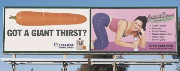
Even though we think our message is super cool in the conference room, it doesn't mean that the message is appropriate for the generality of society. Try to think of appropriate ways to catch your consumer's eye that does not involve large massacres!
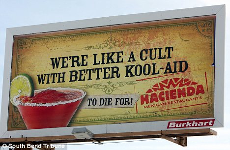
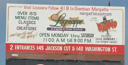
This billboard does not have a clear message. There are so many things going on that the eye does not know where to focus so we just glaze over and this sign becomes invisible. even searching for this image and downloading it and looking at it right now, I still have not read all of the cluttered messages on it!
Make sure when you purchase your billboard space that you know exactly where the billboard is and what surrounds it. What a disappointment to invest precious marketing dollars only to have your sign hidden behind trees!

Since we only have a few seconds to catch the passer-by's attention, stay away from fancy fonts like the ones pictured below. There is no way to read the text that is under the word "resort".

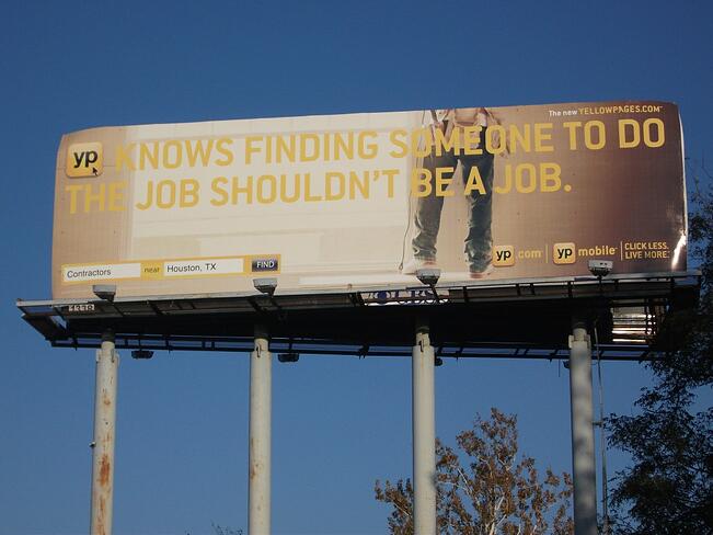
Before putting up your billboard art, it is a good idea to print it out very small and see if it reads easily and quickly. The example below show poor color choice of font. There is not enough contrast especially on the left hand side of the billboard. This will not be an easy read driving by at 65 miles per hour.
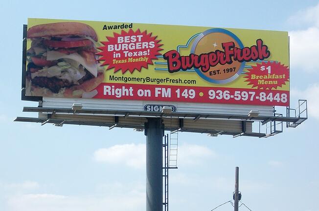
The goal of billboard design is to get customers to use your service or buy your product. If you put up a not-so-appetizing shot of your burger, it most likely will work against you! If you are going to invest in a billboard, invest in professional photography as well.
Here is a prime example of cramming in too much text and having to make the text too small just to fit everything in. For the most effective messaging, think about what the main message you want to get across and try to say it in 7 words or less.

Depending on placement, thousands or even millions of people could see your billboard. Pay close attention to these 9 fails so your billboard does not end up on a "Billboard Design Fails" blog post! If you want a professional to review it, feel free to give us a call! Better yet, we can design the billboard for you so you can avoid any mishaps from the very beginning!


Lorem Ipsum is a simple dummy text used as a dummy text contents. Lorem ipsum will be replaced. Lorem Ipsum is a simple dummy text used as a dummy text contents. Lorem ipsum will be replaced.Lorem Ipsum is a simple dummy text used as a dummy text contents. Lorem ipsum will be replaced.


