In an effort to prepare for a big menu revamp for one of our clients, the team here at Kulture Konnect has spent the past week researching menu design and compiling the good, the bad and the ugly. In the process we came across the biggest restaurant menu design fails. Some restaurants with the highest Yelp ratings did even have a menu.
The menu is the backbone of a restaurant. It displays the very food that your restaurant is made up of. A menu must be clear and legible so it effectively directs people through the list of your best offerings. How many times are you deciding between going to your favorite restaurant or trying out a new one down the street? So you build of the courage to check out the new one. You get there and take a look at the menu and decide to go back to eat at the restaurant you already feel comfortable with. Without the basics of design, it can make the fencesitters walk right out of the establishment after just one look at the menu. Below we share seven menu designs gone wrong and what the bad ingredient is.
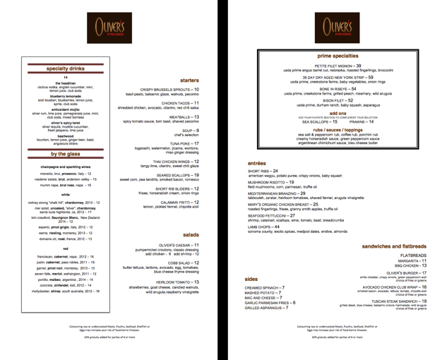
Menu Fail #1: Inconsistent Layout
On the menu below, the designer couldn't decide between left justified, right justified or centered so they decided to use all three! The logo looks as if it were cut and pasted out of a magazine and the font that the prices are in is double the size of the menu item titles. This layout is all over the place. FAIL!

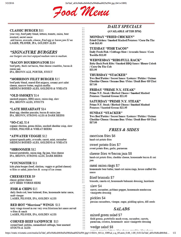
Menu Fail #2: Text Hierarchy is Incorrect
This menu has no section hierarchy. Basically the entire menu is one big blob of text. Some of the text is in all caps and other parts are in all lower case. Commas are used sometimes to separate menu descriptions and other times slashes are used. FAIL!

Menu Fail #3: Illegible
The most important element of a menu, above all else, is legibility. BIG FAIL!


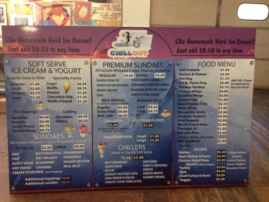
Menu Fail #4: Prices Stand Out
Why would you design a menu board to be a dark color if you know that the prices are going to be on white? This looks so tacky. The prices are what stand out and not the actual menu items. FAIL!

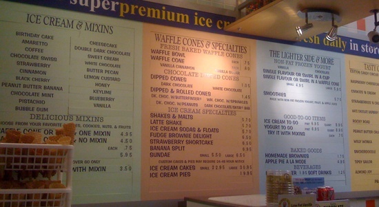
Menu Fail #5: Blockage
If parts of the menu board is covered with shelves or baskets, then it is not in the best location. Even if the section that is covered is not that important, it just looks unprofessional and ill-planned. FAIL!

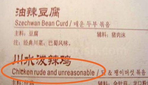
Menu Fail #6: Bad Translation
Thank you for translating but maybe Google translate isn't always the way to go! Get a fluent speaker to double check your menu. FAIL!

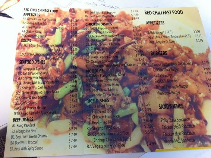
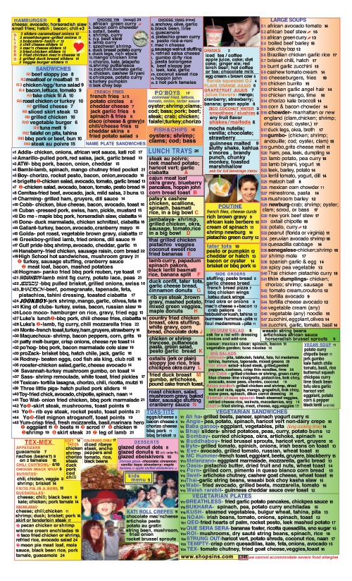
Menu Fail #7: Clutter
And the king of all menu fails is the menu below. Personally, I would walk right out of this place as soon as I saw this menu. It is so cluttered and packed that There is no way to even know where to begin to decide what to eat. MEGA FAIL!

In conclusion, there are so many menus out there that really are an embarrassment to the definition of design. If you are running a restaurant, be sure to look over your menu so you do not end up on the next restaurant menu fail list. The menu is the first thing guests ask for when they want to try out a new restaurant. Guests are even looking online to view your menu even before stepping a foot near your establishment. Make sure your backbone is looking good, is legible and appealing. Better yet, contact us and we will give you a helping hand!
Improve your bottom line with this detailed free Guide to Menu Design below!
