Cutting-Edge Marketing to Grow Your Business.
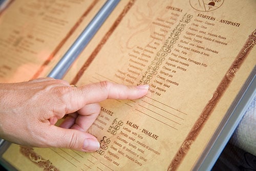
Menus are a vital marketing tool for any restaurant. They influence guests' first impressions by creating certain expectations about the food, beverages and atmosphere. Developing a successful restaurant menu requires an in-depth understanding of guests predilections.
The main purpose of a menu is to visually appeal to guests, direct their attentions to specific items to enable predictions and to create loyalty and guarantee return visits.
As an extension of your restaurant's brand, a menu will need to have in mind design and layout, color palette, type selection and treatment and even paper selection. When a menu is presented to a guest, not only a sales transaction is initiated, but also a relationship. Menu presentation, design and item placement and descriptions all contribute to the guest experience.
Unfortunately, a lot of restaurants don't spend much time or resources in their overall marketing efforts, let alone their menu design. Here are the 10 most common restaurant menu design mistakes when:
Menu descriptions have to create guest interest and generate sales. Short and accurate descriptions create an image in the guests mind about the value of the food they are getting. Long descriptions take too much space and confuse guests. Remember that some words have more selling power than others, for example "hand-battered" vs. "fried."
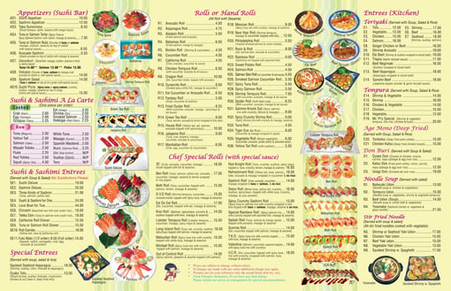
Having too many items can be overwhelming and confusing for your guests. It also makes it more difficult to lay out the general structure and reading flow of the menu. In contrast, having too few items will create a sense of lack of options. The fact that you have the ingredients to make 100 dishes, doesn't mean that you have to have them all in your menu.
A price list is one the biggest mistakes in a menu. It normally comes in the form of smaller to bigger amount defined by a dotted line to the left. A price list simple gets your guests used to shop by price rather than their actual food preference. And that takes us to...
Dollar sign overuse gives the impression that the experience is not about the food and atmosphere, but rather how much can the restaurant get from the guest.
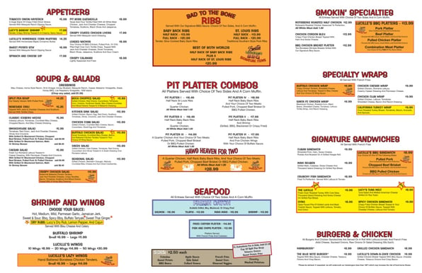
Restaurants usually have a couple of items that they want to merchandise, but some times they go overboard and, instead of simply emphasizing what you're most proud of, they shout at guests' faces. When merchandising your menu, it should subtly guide your patrons highlighting your best dishes with the highest gross margin.
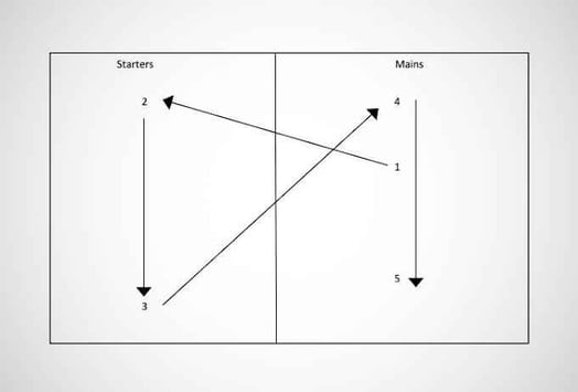
Many restaurants don't give much thought to where and how items are placed on the menu. In many cases, section and item placement as well as reading flow are an afterthought more than an actual strategic decision.
There are a few different ways to maintain a logical reading flow for your menu, and what you apply should depend on how your research about your audience. For example, appetizers, sides and desserts are all very important to your overall success. But when a guest is reading your menu and deciding what to get is better if this sections don't cover the best areas of your menu.
Your brand is one your most important restaurant assets and it should be translated into all and any marketing material and initiative you use, including the menu. Unfortunately, a lot of restaurants stop at the development of a logo and don't consider the impact of the lack of a comprehensive brand to their perceived personality and reputation.
Brand continuity doesn't simply mean to put a logo at the top of a menu. It means that there are considerations such as color, type/font selection, imagery and illustrations and more. So, let's think about the next two mistakes...
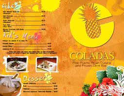
A well done typographic treatment can influence your guest in terms of the personality of your overall brand as well as what you want them to notice first on your menu. Your type/font selection will either draw people in or scare people out by expressing the general feeling about the experience they are about to have.
For example, a script font paired with a bold san serif font can show elegance and sophistication. But a hand drawn font combined with a regular san serif font might give demonstrate a kiddish personality.
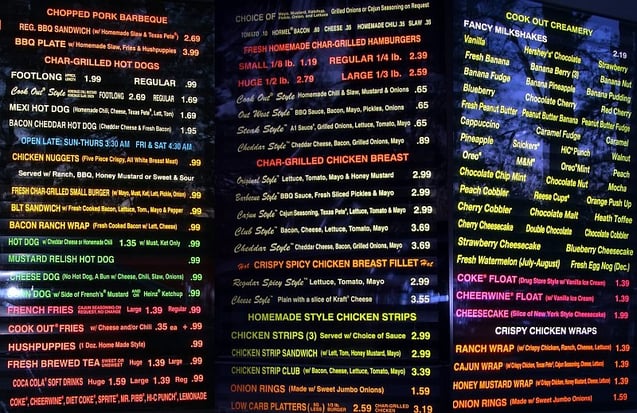
Your color palette should come mainly from your brand. However, you should have in mind the effect that your brand's colors will have in the mood and appetite of your guests once they are on your menu. The right colors create a convey a personality, increase the appetite and draw attention to food items.
Some menus use illustrations, photography and other design elements to engage guests visually. Unfortunately, some restaurants tend to use low quality photos or clip art. This detracts from the overall goal of a menu.
In many instances, the fear of change is bigger than the actual challenge of investing time and resources to have a well-designed menu. So, things pretty much stay the same. It doesn't have to be that way! Think of your restaurant menu as an investment and an opportunity to increase your revenue.
Finally, the best part of it is that you don't have to do it alone. Why would you, anyway? So, make sure to hire a professional team. When you hire a team, you're paying them to spend time on your brand and pay special attention to all the details that will allow you to maximize the benefits of your restaurant menu.
Learn 10 Reasons Why You Should Pay Attention to Your Menu Design With This E-Book below


Lorem Ipsum is a simple dummy text used as a dummy text contents. Lorem ipsum will be replaced. Lorem Ipsum is a simple dummy text used as a dummy text contents. Lorem ipsum will be replaced.Lorem Ipsum is a simple dummy text used as a dummy text contents. Lorem ipsum will be replaced.

