Cutting-Edge Marketing to Grow Your Business.

For any business, a form of identification (like your license) are your business cards. These cards allow your contacts to be able to identify your position and what company you are representing. Thus, making something so tiny in size a great marketing tool for your company to generate clients with.
Unfortunately, these could also be the reason that you aren’t getting any business. Why is this you may ask? Well, there is sort of a “craft” so to speak when figuring out what makes a good business card versus a bad one. Some companies make the tiniest mistakes, that aren’t looked at before they send the cards to print. No worries though, we at Kulture Konnect are here to help.
Whether you hire a professional or decide to take a DIY approach, here is a list of five common business card mistakes you can avoid to ensure that your business card is up to today's standards.
Solution: Make a test print, print that sucker out to size on regular printer paper. It's better to get all the kinks out before sending it to the real printer where they print 100's at a time and you realize to late that the text is too small.
Another thing to note is not everyone's eyesight is the same. What may be clear and readable to you may not be to others. So, go ahead and pass that sample card around and get feedback on if they are able to read the small print.
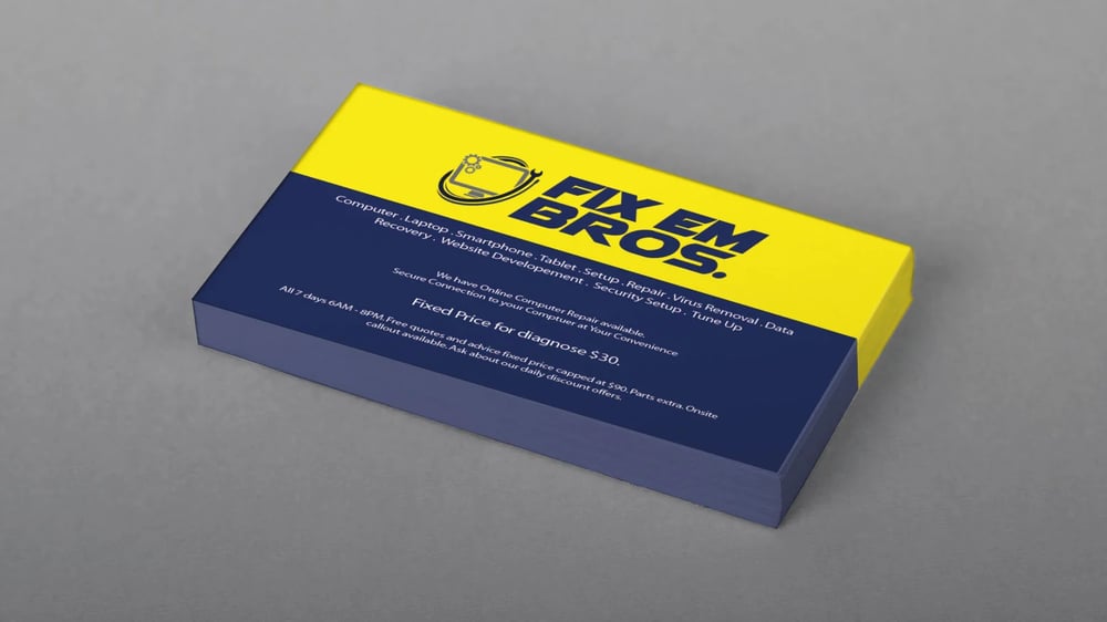
Your space is limited on a little 3.5" x 2" card, so it's important to include as much information as you can. In doing this you could also run into the problem of having TOO MUCH information. Making it too cluttered and hard to read.
Solution: Only include the information that is necessary. That includes information like your name, job description, phone number, email, address (if applicable), web address, and social media (again if applicable). It’s also important to have your company logo on there so contacts know what company you are representing.

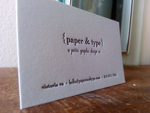
You know how the saying goes, “First Impressions are everything!”, the same goes for businesses. It’s not only how you present yourself that counts, it's also the lasting impression your card leaves... being that after you walk out of that room, your card is all they have left. You don’t want to hand a client something that is easily damaged or feels cheap.
Solution: Invest in higher quality paper, go for thickness rather than what is thin. The thicker the paper, the more suitable it is for lasting longer with no damage. Yes, this could get costly but its worth it in the long run when dealing with first impressions.
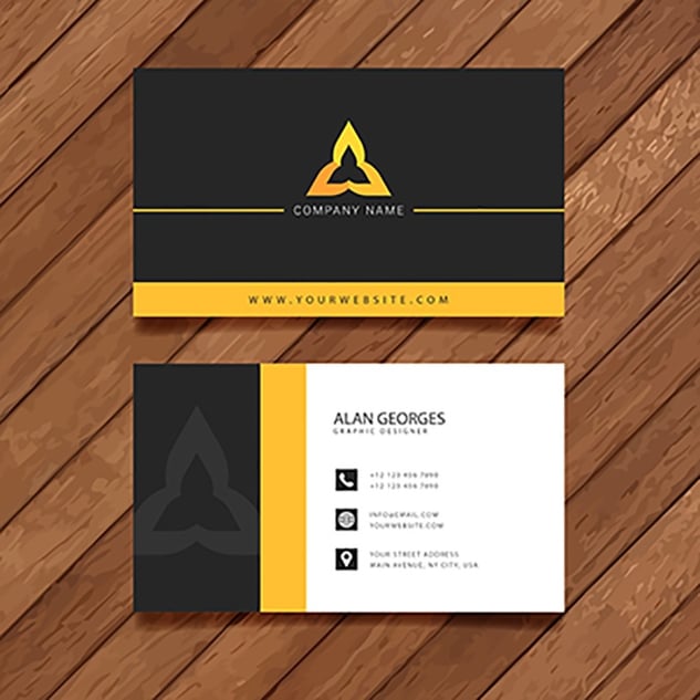
You only have so much space for information on one side of the card. Don’t leave the back side empty. You're not utilizing your space the correct way by going one-sided.
Solution: Utilizing the reverse side allows you to make white space your friend. Add your company logo, brand promise on this reverse side. This allows you to space out the other information creating more white space that makes it easier for people to read your information. The back side of the card allows room for extra fun details.
Your card should represent you, or your company. If your website is Orange and white but your card is bright red you're not being consistent. You want all your collateral, whether it be for Web or for Print, to be the same.
Solution: Utilize your standard design elements and colors. Make sure it matches your brand so people don’t get confused when they look at all your pieces.
In conclusion, did you notice any of these common mistakes that you might be making on your business card? We are here to help. Just having an extra pair of eyes look over your card could be really helpful! Feel free to send your card our way!
Looking to get your business cards done? We can help you with that! Contact us for pricing details (951) 479-5411



Lorem Ipsum is a simple dummy text used as a dummy text contents. Lorem ipsum will be replaced. Lorem Ipsum is a simple dummy text used as a dummy text contents. Lorem ipsum will be replaced.Lorem Ipsum is a simple dummy text used as a dummy text contents. Lorem ipsum will be replaced.


