Cutting-Edge Marketing to Grow Your Business.
Billboard design presents a huge opportunity for marketing directors and business owners. Unfortunately it’s an opportunity that many seem to waste. Just notice the next time you take a drive and see if these five tips for effective billboard design are at work.
You’ve got five to fifteen seconds to get your message across. Are you stuffing the space with too much copy or have you drilled down far enough into your unique value proposition to know what to say in as few words as possible?
You must be certain you’re communicating one message only. It’s easy for two or even three to suddenly slip in. With people driving by on average at 65 mph, they won’t be able to retain both your brand and its message unless it’s laser-focused.
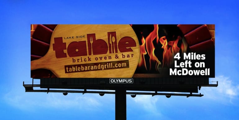
See the billboard above for a great example of excellence in billboard design graphics. The colors are simple and the imagery is enticing. Set off against a blue sky, it leaps out at you. This is the time to hire a professional marketing and design agency that can really deliver the goods. Make sure you budget wisely and not only invest in the space but the design too.
This would seem to go without saying but once multiple people start getting involved in the design of an ad you can’t believe how much gets lost by adding more. You must be able to read the billboard quickly and well from a distance. It sounds elementary but it’s really about being disciplined, which is difficult when others are involved and want to be heard.
This is going to be the real test. Ask them what the message is and how it makes them feel. Ask about the color. Have them repeat back what they read. You’ve been so wrapped up in this project at this point that you need their objective input. Take the extra step and get it.
When you’ve implemented these five steps, you end up with an outdoor ad like Abuelo’s. It’s a great example of effective billboard design. If you don’t hit the mark you end up with examples like this.
We hope this blog post was helpful to you. For more ways on how you can improve your billboard design, give us a call at 951 479 5411.


Lorem Ipsum is a simple dummy text used as a dummy text contents. Lorem ipsum will be replaced. Lorem Ipsum is a simple dummy text used as a dummy text contents. Lorem ipsum will be replaced.Lorem Ipsum is a simple dummy text used as a dummy text contents. Lorem ipsum will be replaced.
