When you think of a company, the first thing you might notice is their branding. When you think of Nike, the swish logo pops into your mind along with the slogan, "Just do it!" With Calvin Klein you see the CK. Logo design is really a key component to uniquely identify a company. It's the recognition that your customers and competition will have to associate your brand with. Below, you will see brand marks that are dreadfully the worst logos ever! These examples will give you an idea why research and really understanding what you're doing is a key component to logo design. Let's begin with number one.
1. Sexual innuendos
With this logo you can instantly tell why it would be included on this list of the some of the worst logos. There becomes a point when you ask yourself, "how did they get away with this?"
Clinica Dental
This logo could really be fixed by the removal of the art graphic. I would use a Serif font instead of a bold Sans Serif font. As cliché as a tooth might be, it is an option it would all depend on the layout and if the logo calls for an art object, because the logo could just be a typographic mark.
2. Inappropriate Incorporation of a Graphic in Place of a Letter
The Computer Doctors
I think it's super tricky to try to incorporate a graphic to represent a letter within a logo. The use of this mouse in the logo just makes for a very inappropriate logo, especially with the mouse wire attached. To fix this, it would really be beneficial to make the art a secondary option and more of a computer screen or gears.
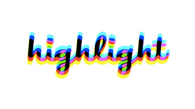
3. Hard on the Eyes
Highlight
With this logo, it is very rough on the eyes and extremely difficult to look at. It does not really resemble the word 'highlight'. One way to adjust this is to maybe just use a highlighter effect as in a bar within the word, but that would ultimately need a purpose on why to use this.
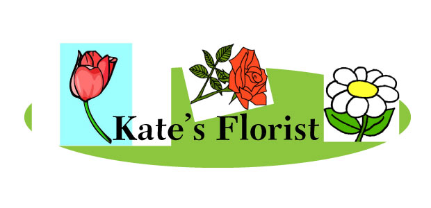
4. Horrible Clip Art
Kate's Florist
Clip art is never the way to go when creating a logo. The white borders on the flowers really just ruin the whole effect and how they are positioned just makes for a horrible layout. A way to fix this would be to use a vectored flower with the combination of a script font and a sans serif. Even with that change you would really have to work with different options to make sure that everything visually goes well together.
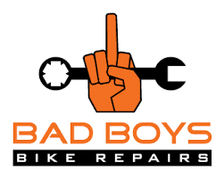
5. Vulgar
Bad Boys - Bike Repairs
Now with this logo the use of the hand sticking up the middle finger, I don't find really necessary just to get the "bad boys" across. This could be solved through font choices and a different graphic.
Logo Design Tips
Know your client, understand your audience, and your competitors (These three things will really help you in terms of a certain direction that you should take when creating logo versions)
Try the use of different font families
Don't stick to just one style of fonts
Mix and match but only if it flows
A big component is color schemes. You want to stay loyal to the brand but you also have to have a reason on choosing those colors.
In Conclusion
A logo has a lot more to do with the research and knowing your client than just putting things together. You really need a reason behind your choices, why it would help your client succeed and why it helps represent them. Also, always make different options, your first go won't always be the best. It's good to give a couple options but not too many an there is a tendency when the more you create, you might lose sight of the direction you are going.
Are you seeking marketing and branding professionals? Contact us herefor more information.
Lorem Ipsum is a simple dummy text used as a dummy text contents. Lorem ipsum will be replaced. Lorem Ipsum is a simple dummy text used as a dummy text contents. Lorem ipsum will be replaced.Lorem Ipsum is a simple dummy text used as a dummy text contents. Lorem ipsum will be replaced.