Cutting-Edge Marketing to Grow Your Business.

Can all of us agree that happy hour is the perfect time for your guest's to get together with friends and co-workers after a long stressful week? It's your customer's chance to let loose and enjoy good food with a tastey drink in tow at a great deal. With that said, you want to make sure to create an appealing happy hour menu that will have your customer's coming back for more. Here are four creative happy hour restaurant menu designs that do a great job at showcasing offers. So what do you say? Lets get started!

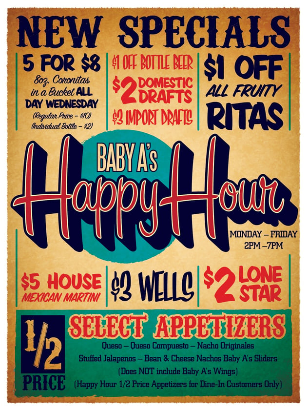
Baby A's...I love this design for their happy hour menu. They highlight everything that they have to offer. I think one of the best qualities about it as well is their use of typography making it a very beautiful and well designed menu. It calls you in with the main and center point of it being "Happy Hour" and then your eyes start to wonder around to the other aspects of the menu being as to what they offer.
Measure the popularity of your menu items with this Fill-in-the-Blank Worksheet. Download here.
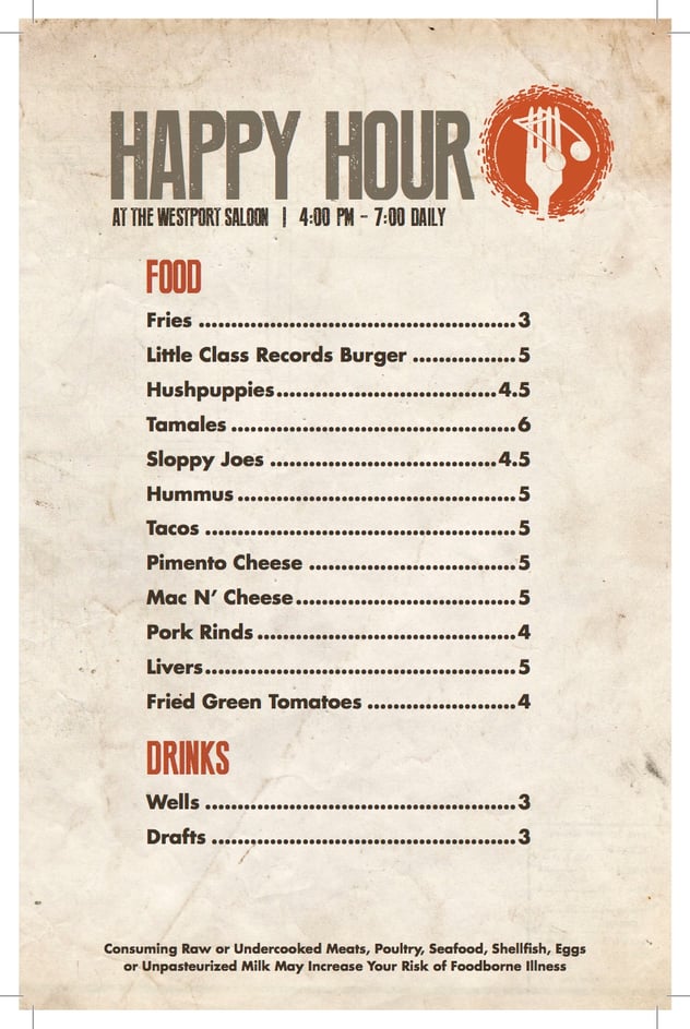
Westport Saloon. Kansas City, MO

Westport Saloon does a great job of keeping the rustic vintage feel of the restaurant that I got from their website into the menu. I like the fact that its simple and to the point of just showcasing what they have to offer. Also, everything is at a reasonable price might I add, defiantly a place I would go to for Happy Hour. Ha!

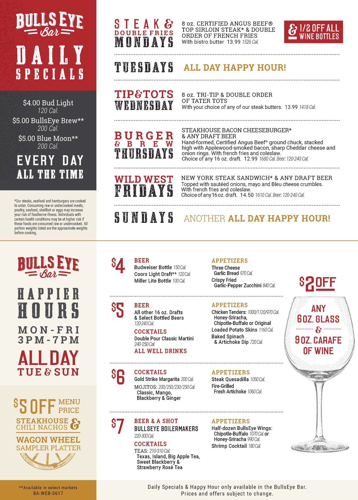
Black Angus has a big advantage over these other restaurants for the main being of them being a bigger corporation. I like the clean organized look and feel they have for their menus. Black Angus like Baby A's does a very good job at using text to really get across what they have to offer. The wine glass offer is a very nice touch to have illustrations with type to create a nice subtly design.

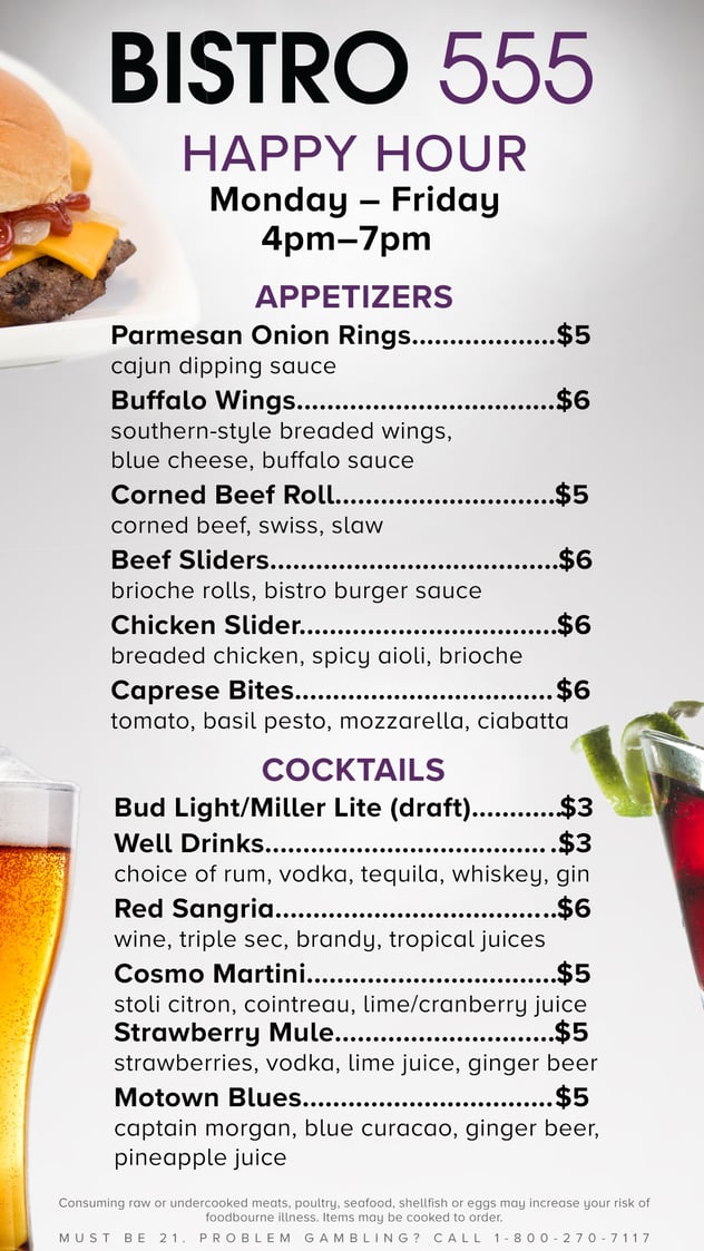
Bristo 555 has a very different approach to it by adding images to their menu. While they keep straight and to the point it allows the views the have a breather from all the text to be able to notice the images. While this is great it can also become a tad overwhelming making the menu look very busy. In the end, it is still a very well designed happy hour menu.
I hope this gave you a good idea on how to go about creating your next Happy Hour menu. Some things to keep in mind. Less can always be more, using type in a creative fun unique way can go a long way. Step outside of the norm and get creative but dont stary from being organized. Happy Hour is suppose to be fun allow your self to be creative. Happy Designing.
Updating your menu and looking for a professional design? Contact us here!
Measure the popularity of your menu items with this Fill-in-the-Blank Worksheet. Download here.


Lorem Ipsum is a simple dummy text used as a dummy text contents. Lorem ipsum will be replaced. Lorem Ipsum is a simple dummy text used as a dummy text contents. Lorem ipsum will be replaced.Lorem Ipsum is a simple dummy text used as a dummy text contents. Lorem ipsum will be replaced.


