
Cutting-Edge Marketing to Grow Your Business.
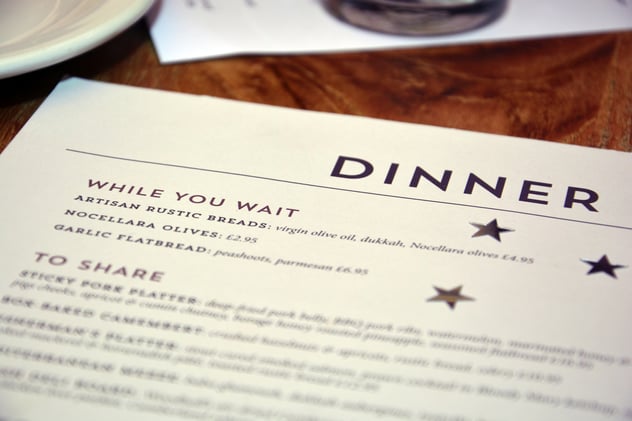
Are you struggling with organizing your menu design for fall? For instance, how many menu items should you include or what should you highlight? If you answered yes to struggling then you're in luck! Below we have covered three different layouts with two menus that show a perfect example of layout, and another that struggles with branding.
There are several reasons you might want to change your menu design, those reasons can include product shortage, cost, time it takes to prepare a meal or just looking for a change. Whether you offer five menu items per section or fifteen, the presentation on the menu should be easy for the customer. Sectioning off your items based on categories is a plus. Also, make sure that it is clean and not all over the place.
Let's take a look at some restaurant menu design ideas that highlight what to do for your menu and what you can avoid. 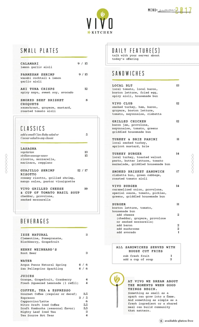
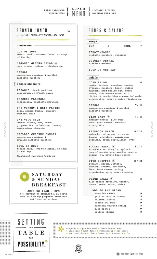
Vivo Kitchen
Location: Apple Valley, MN
Placed in what looks like a menu sleeve Vivo Kitchen's, menu is simple but still designed beautifully in the dividing of each section being neatly organized. Each section is small and perfect for choosing something that you could be in the mood for. When menus are overloaded, you can tend to feel overwhelmed.
This quote comes from their website, and I think it fits well, especially with the fun add-on of the light match next to their flame artwork being animated. “Something as small as a spark can grow into a flame. And something as simple as a fresh ingredient or a shared meal can build community that matters.” This shows how branding is important even when it comes to your menu.
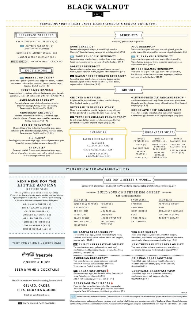
Black Walnut Cafe
Location: Multiple Locations, U.S.
I love Black Walnut Cafe's menu design because it sticks to that café vibe. The one downfall of the design is that it looks a bit crowded and overwhelming on the main food side. However, the design company did a good job of allowing sections to breathe. With the grid format used within the menu it allows the restaurant to section off their menu items with ease through each, because it definitely would be odd to find the tex-mex omelet under the burger section!
State and Lake Chicago Tavern
Location: Chicago, IL
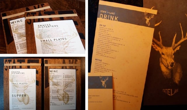
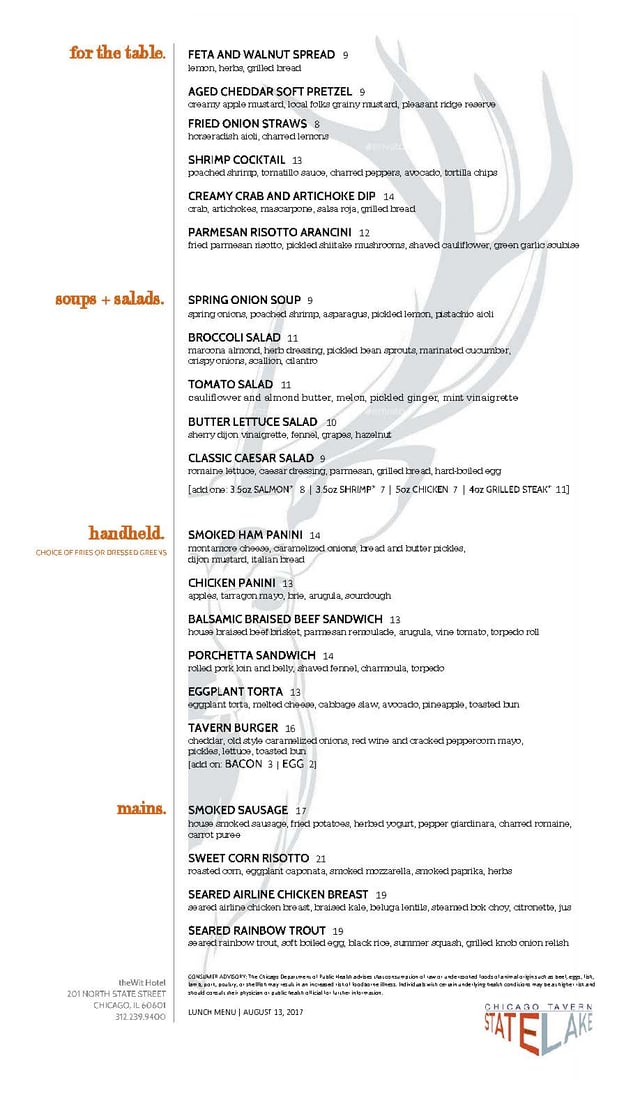
Bound in a wooden menu frame, State and Lake Chicago Tavern's menu branding gives off the idea of being an outdoorsy restaurant, yet the interior is more of a high class, fancy restaurant. While I think the sectioning and food offering for State and Lake is perfect, the branding really throws me off on what the vibe of the restaurant is. When it comes to branding for this restaurant you would want the feel of the restaurant to be cohesive through out, for example being that the interior is more elegant you would want that to translate over to the menu and typography can play a huge factor in that. For starters, it looks to have about five or more different font styles and formats and that can throw someone off who has an eye for these kinds of consistencies. For this reason, this would be a what NOT to do when thinking of how to redesign your menu.
In conclusion, while you want the food to speak for itself, it's best to keep things simple and not overwhelm your customers with the menu because you want them to come back. While you may think branding isn't a big component for the menu, you are wrong. Keep things flowing and not stepping outside of your brand. Some things to consider is to always be consistent with your brand / restaurant identity, sometimes less items per section is better not only for your customers but for the cooks as well (a lot less money on food supplies!), and lastly, don't forget to have a menu holder whether its lament, menu book holder, or a menu sleeve - give it a nice presentation.
If your restaurant is seeking designers contact us today for more information about our services here.


Lorem Ipsum is a simple dummy text used as a dummy text contents. Lorem ipsum will be replaced. Lorem Ipsum is a simple dummy text used as a dummy text contents. Lorem ipsum will be replaced.Lorem Ipsum is a simple dummy text used as a dummy text contents. Lorem ipsum will be replaced.


