
Cutting-Edge Marketing to Grow Your Business.

You’ve worked hard to give website visitors all the information, the features, the specs and appeal about your products and services. Now, all they need is a little push in the right direction. And that’s where an effective website CTA comes in.
A Call to Action (or CTA, for short) is a term that describes a phrase prompting someone to do something. When it comes to a website call to action and design, they are usually a text, image, or button prompting the visitor to do something—enter personal information, sign up for an email newsletter, download an informational packet, or even continue on to a data capture or checkout page.
Website call to actions are used to clearly guide the consumer through the buyer's journey process. Without clear CTAs on your website, it can be challenging for visitors to know how to proceed from a webpage to another. Therefore, a CTA is important because it effectively guides customers into further interacting with the site.
When it comes to inbound marketing leads, effective CTAs have been proven to significantly increase rates—meaning more customers are clicking to get to the next step. In fact, certain CTAs have been found to boost conversion rates by up to 121%! Depending on what your goals are in a CTA, that can mean more sales, more followers, and more downloads. All by including an effective call to action on your website redesign.
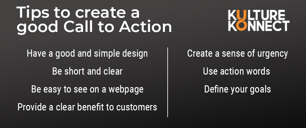 Tips to create a good CTA
There are a lot of different factors that go into creating an optimal CTA that generates genuine action. However, some of the most essential tips to remember when creating your website call to action are to:
But that’s not all it takes to create the perfect CTA for your website redesign. One of the most important things to keep in mind is the goal of your CTA—what action you want your visitor to take. Depending on your goal, your CTA will differ significantly.
For example, if your goal is to get more subscribers or social media followers, a good CTA might be “Subscribe Now” or “Follow for more.” From there, customizing it to more closely suit your niche is also possible. A YouTube cooking channel’s CTA might say “Click Subscribe for Cooking Tips” or “Follow for Daily Fresh Recipes.”
On the other hand, an eCommerce website that’s trying to convince you to purchase something might have a CTA such as “Add to Cart” or “Checkout Now,” in order to make it extraordinarily easy to buy items online.
When it comes to the placement of your website CTA, the most important thing is that the call to action can be clearly seen by all website visitors. Many websites prefer for the CTA to be at the top of the page, so that it immediately grabs attention. The right side is often preferred over the left, as people who read left-to-right will naturally gravitate their focus to the right side.
Having a CTA in the middle of the page can be a great way to link content with action. If you’re describing something interesting in your webpage content that might persuade visitors to take action, placing the CTA close to content can be highly effective.
Lastly, a website CTA at the bottom of the page can neatly wrap up everything covered in the page and direct visitors to the next step on their journey.
After you’ve decided where to place the CTA, it’s important to consider the structure of the CTA. CTA buttons are easy to place anywhere on a webpage and often pair well with informative text that provides context to the CTA. Similar to buttons, CTA banners are generally longer and provide more information, running the width of the page at either the top or bottom. Lastly, anchor text CTAs are hyperlinks embedded directly into the text. An anchor text can quickly direct a viewer to other relevant content. Each type of CTA has its own advantages that should be considered during your website redesign.
Having a CTA with the right placement, wording, and design on your website redesign can help convert visitors into customers, as well as seamlessly guide consumers to the next step off your company’s marketing process. Carefully consider the goals of your CTA and the content on your webpage to determine the CTA structure that best suits your company and its unique goals!
A well-designed CTA isn’t the only text that makes a huge difference on your website redesign. Content marketing is also highly crucial–which is exactly why we’ll be looking into all of the benefits of developing a content strategy before a website redesign in the next article!


Lorem Ipsum is a simple dummy text used as a dummy text contents. Lorem ipsum will be replaced. Lorem Ipsum is a simple dummy text used as a dummy text contents. Lorem ipsum will be replaced.Lorem Ipsum is a simple dummy text used as a dummy text contents. Lorem ipsum will be replaced.


