
Cutting-Edge Marketing to Grow Your Business.
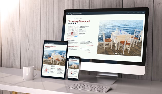
If there's one thing all of us have in common, it's the love for good food. Everyone has their own favorites and preferences. But when someone wants to taste something new or different, the first thing they'll probably do is search online. This is where a restaurant's online presence comes in and a big part of that is its website.
Unfortunately, many of the websites in the restaurant industry today still are either bland or simply unattractive. Some websites shove too much information down the visitor's throat, much like a dish with too much garnish where the main feature is lost or an overwhelmingly strong flavor that changes a diner's facial expression on the fly; it's simply deterring. Others are just obviously outdated in terms of content or design or just simply grotesque in appearance, like ordering fresh calamari and being served canned, frozen and reheated ones... and from last week too. Ouch!
A good restaurant website is all about giving its visitors what they want: the menu, hours of operation, location and additional details like online ordering and curbside delivery. While things like e-clubs, website-exclusive promos and the grand story of how the restaurant's first ever owner came up with the idea in 1870 can be fun or helpful, but often they are forced upon the visitor in a tasteless manner. This can put a sour taste of disapproval in the visitor's mouth and ultimately drive them away from the website, never to return again.
The following are examples of the best restaurant websites that make you want to visit the restaurant and actually eat there. They are able to convey the food, atmosphere and the feel of dining in the restaurant without actually being there yet.
Use this simple 11-step checklist for your website redesign
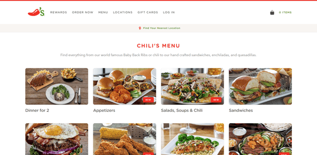
Chili's website offers a simple, clean and non-intrusive experience. It is no nonsense in that the images of the food do the talking.
The menu is also clean and laid out in a straightforward manner, immediately letting visitors know that they have rewards and that visitors can order directly from the website.
Typically when you visit a restaurant's website, you are most probably looking for information; be it menu items, directions or a guide on how to order online or maybe even check whether they have special offers.
The overall tone of Chili's design does just that and nothing more. Perfect.
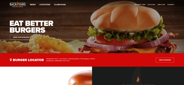
Backyard Burgers uses bold fonts and generous whitespace along with rich colors to define sections of the website. This makes each section of a page distinct and well-defined making it easier easy to eyes and therefore adds user-friendliness to the overall design of the website.
Also, notice that the main pages of the site are located at the left while the secondary pages are on the right side, utilizing a smaller font size to add some visual hierarchy to the navigation bar.
The two points above are commonly regarded as best practices as they add clarity and ease of use to any design coupled with the fact that they are not at all hard to implement design-wise and code-wise. Sadly, most restaurant websites out there do the exact opposite, going for a sloppy, undercooked design with an obscene amount of noise in the form of too many images and inconsistent animations.
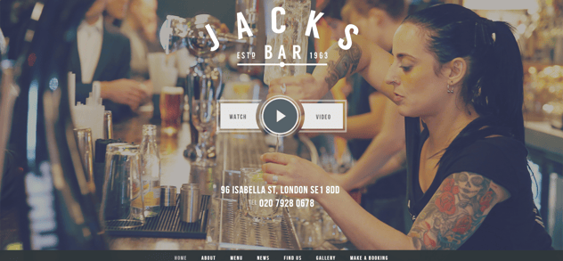
The website for Jack's Bar uses black and white along with imagery to create a slightly minimalist approach to its design. The images show that the bar is frequented by lots of customers and gives off that "locals' go-to place" feel while still staying classy.
It's also a good example of a one-page website, where all the information is served on one page in a clean and organized manner, taking away the need of clicking on different pages. Instead, it only requires users to scroll to the relevant sections.
And there you have it: three examples of the best restaurant designs of 2017. Remember, the most important thing is giving those key pieces of information that will get your website visitors' mouths watering and driving over to your restaurant to eat!
If you're seeking professional help for your website, visit us here. Kulture Konnect can help you with a new website or redesign.
Looking to redesign your website? Use this 11-step checklist. Download here!


Lorem Ipsum is a simple dummy text used as a dummy text contents. Lorem ipsum will be replaced. Lorem Ipsum is a simple dummy text used as a dummy text contents. Lorem ipsum will be replaced.Lorem Ipsum is a simple dummy text used as a dummy text contents. Lorem ipsum will be replaced.


