Are you new to Facebook? Or are you just trying to get your restaurant more up-to-date with the social media times that we are in? Whatever the case may be, you may have the question of "what can a Facebook Cover do for me?" These covers can do quite a few things in terms of helping people interact or visit your restaurant.
When creating your Facebook cover you have to have a couple things in mind. What is it that you want to convey to your customers? Are you running a special on a certain entree that you would like them to know about? Is there a big event happening like a restaurant milestone, or would you simply like to give thanks? Or would you just like to showcase a high resolution photo of one of your mouth-watering dishes to get them craving your food?
Take a look at the following for great ways on how to take advantage of your Facebook Covers. Here are several examples of do's and don'ts for your restaurant's Facebook profile.
Best Examples of Facebook Covers
Outback Steakhouse
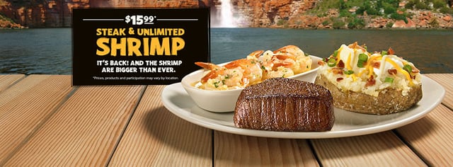
This cover for Outback works well because they’re advertising an entree that has returned to its menu. Outback is letting people know by including the message “It's Back and the Shrimp are Bigger than Ever!” It's allowing the consumer to see the meal, the meal's name and the price so they can get it back into their minds and hopefully order it when they visit Outback again.

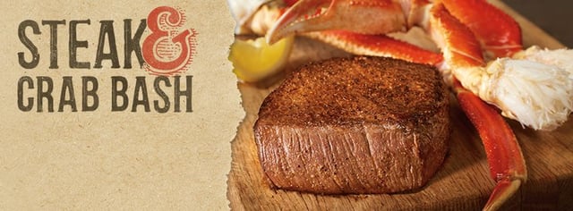
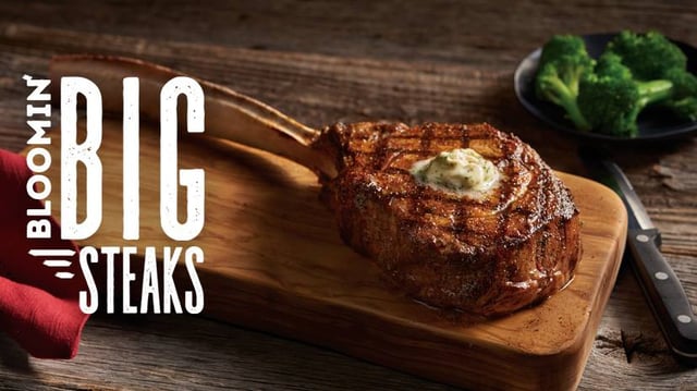
These images work because of their simplicity; just the subtle showcase of a meal with the item name. It's not too much to take away from the meal, but it's also not too little that you don't crave it just a little by looking at it. They also make sure that it fits with the style of their restaurant. It is always very important to keep your branding cohesive.


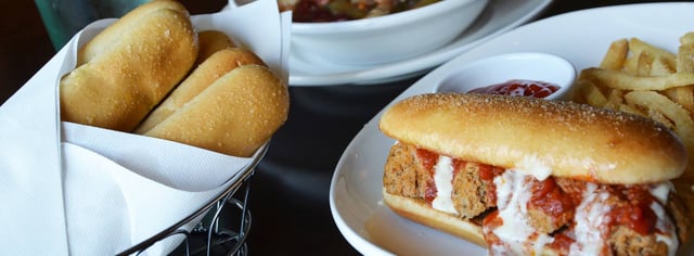
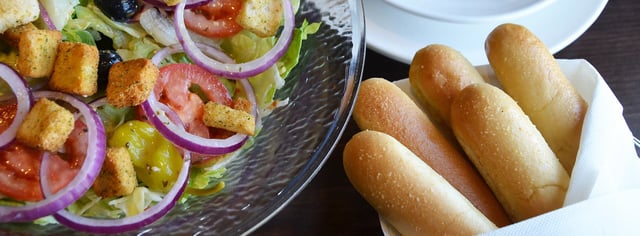
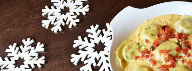
Olive Garden
With Olive Garden they take a different approach to how they display their Facebook covers. No use no text, but rather let the food and the hi res images speak for themselves. They are very good at making sure the Facebook cover image is simple but gets the job done in making you want some pasta.


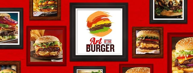
Red Robin
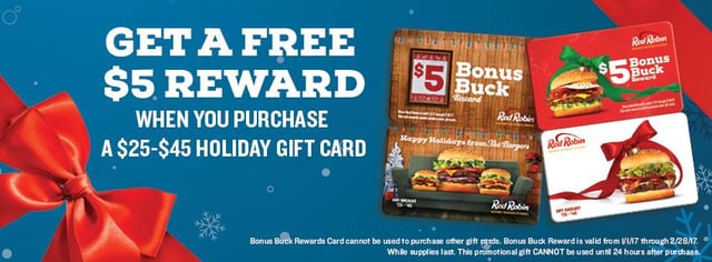
All restaurants tackle branding differently as evident by Red Robin's Facebook cover. The examples below showcase how they can make their covers more fun, with a nice collage of all the burgers in one, and promoting their gift cards in the other. It’s presenting the food in a creative way, and letting you know that you can give the gift of good food to your friends and family, while promoting their company.


Bad Examples of Facebook Covers
When giving bad examples, it's not to say the design itself is bad. It was just poorly executed or did not read how the restaurant might have wanted it to. See below for a couple examples from two different restaurants, with a brief explanation as to why these covers missed the mark.
Islands

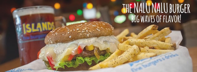
The text gets lost in the lighted background because of how thin the font choice is.

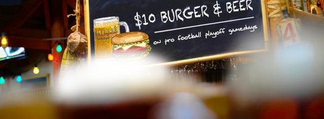
The whole image just gets messy on the eyes. I get the concept they were trying to accomplish, but it just falls a little short because the blurred out drinks become more of the main focus.
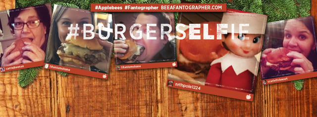
Applebee's

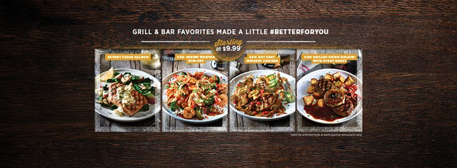
Very nice set up, but where it falls short is how small the text and images are. It is hard to really understand what they are trying to sell.

Nice layout just bad choice of placement for "#BurgerSelfie." It gets lost and text should not go over someone's face, especially when a selfie is the main focus of what they are trying to promote.
Conclusion
Facebook covers won't make or break your company in any way. It is just an added bonus in the advertising process, which is why it's good to make sure you're using and presenting your food and/or promotions in the best way possible to get people's attention. Make sure you are using high resolution images and avoid making things hard to read.
Are you seeking a social media professional to manage your social media accounts? Contact us here: http://www.kulturekonnect.com/contacts/
Download 24 FREE ready-to-use
Facebook Covers here:


