Operating successfully in today’s restaurant industry is not easy for many reasons:
-
Competition is growing aggressive with time
-
Customers are becoming more demanding, and
-
Food quality can’t be compromised.
Simply put, customers today, want to enjoy the a personalized dining experience more than anything else. And from the business point of view, restaurant owners need to make sure they deliver excellent customer experience while maximizing their business profits.
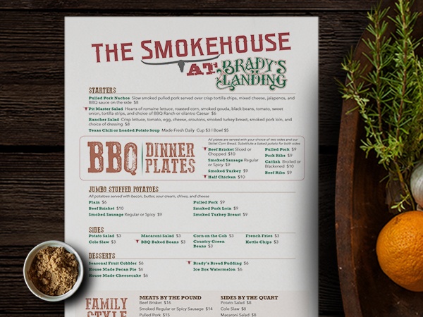
This is where your silent salesperson really helps you the most; yes, we’re talking about your restaurant menu design. Your menu is the most important internal marketing and sales tool. In fact, it’s the only piece of printed advertisement that is actually read by the guests. Once it is placed in the customer’s hands, it can influence the customer regarding, not only what to order, but ultimately, how much they will spend at your establishment. In other words, your restaurant menu design directly influences your sales revenue, so it should be strategic and well-designed.
>> Your menu design can make a major impact on your sales. Find out how here!
According to restaurant consultants who were interviewed by Restaurant Magazine, redesigning a restaurant menu can easily improve sales on average from 2 to 10 percent. If you already have a menu design but it isn’t doing wonders for your business in terms of sales or guest loyalty, then it’s time to redesign it. And what better way to do that, then to learn from your competitors? Find out how your competitors’ silent salesperson is attracting customers and influencing them to spend more and what constitutes a good menu design. Here’s what you can learn from your competitors:
-
Item Placement: Take a look at how your competitors have placed items on their menu. Analysts say that people mostly remember and buy the first 2 items or the last menu item in each menu category. Therefore, the best strategy is to place menu items with the highest gross profits in these places on the menu.
-
Pricing Lay Down: View how your competitors list prices. When skimming through the menu, people often look at the price first before they order. How you communicate prices in the menu can really help you make more sales. What leading industry players do is that they move prices into their menu descriptions to avoid price shopping by customers. This helps customers focus on the dishes, not their prices.
-
Graphics: "A picture speaks more than a thousand words" may be a cliché but is key to an effective menu design. Graphics can set items apart and increase sales dramatically because visuals have greater impact than words.
-
Page Positioning: Studies show that on 3-panel menus, customers often look at the center panel first and then they move counter clockwise. However, on 2-panel menus people look at the top right hand side first. Use this observation strategically to your advantage by putting your high profit items on these positions, such as your specials.
-
Menu Headings: Try using creative menu headings to engage guests. Plus, it also helps to highlight different types of foods in the menu. You can use headings like ‘Our Specialties’ instead of ‘Entrees’ which is quite generic.
-
Know Your Customers: If your target customers are children, then try using appealing fonts and artwork on your menu to draw their attention. If your customers are adults over 50, then keep the typeface of your menu large enough so that it’s easy to read. Font selection also has a lot to do with the personality and atmosphere of the restaurant. For example, the font used for a casual restaurant environment shouldn't be the same as the font used for a high-end restaurant environment where price points are higher.
-
Box Your Items: Research shows that boxed items on the menu get more orders as they draw more attention. Try boxing high profit items on your menus. However, don’t get carried away because too many boxes as well as badly designed boxes can defeat the purpose as they can make your menu design cluttered.
-
Keep It Clean: Keep your restaurant menu design clean; don’t fear white space. White space allows the eyes to pause and rest; and a clean menu design is much easier to read.
-
Brand It: Make sure your design aligns with your restaurant’s brand image. After all, it is your business marketing tool. You can use similar colors or philosophy to design your menu to ensure it communicates your business message and makes a strong impact.
-
Impactful Copy: Mouthwatering descriptions are important to get the customers excited. However, make sure it also includes ingredients because picky eaters want more than just creative descriptions; they want to know exactly what ingredients are being used.
A menu design is one of your restaurant's most important marketing tools. Your menu goes beyond the food you offer, it communicates the essence of your brand, the personality of your restaurant and, ultimately the type of experience your guests are getting.
Are you seeking restaurant marketing professionals? Contact us here for more information.
Visit our portfolio for a glimpse of our work here.
Your menu design can make a major impact on your sales. Find out how below.
