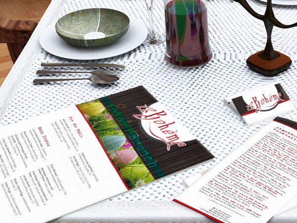
Some might have the assumption that restaurant menus are a simple task, but believe it or not planning and designing your menu is one of the most common problems restaurant owners face when putting one together. Just like anything that comes with owning a business, restaurant menus need structure and strategy as well. Your menu layout should be strategized and structured with categories, item placement and panel arrangements to maximize profitability. Without the proper planning you are bound for failure.
The first step to redesigning a bad menu is recognizing the culprits regarding your menu design. However, some might say they are just not entirely sure what it could possibly be? So, how do you know when your restaurant menu design isn't quite up to par? Below are several questions you need to ask yourself. Here are the 7 signs of why you should invest in restaurant menu design for the new year.
1. You Have a Cluttered Menu
Let's take a closer look at the first sign. Is your menu overwhelming and just cluttered with a number of menu items? If so, then it's time to take a look at your options. Here's why: you want to make sure your menu is easy to understand instead of challenging. According to Restaurant Engine, they would agree that a cluttered menu lacks focus! And too much going on just flat out confuses your customers! A larger menu list also produces problems in your kitchen such as, longer ticket times. Ever heard of the domino effect? Longer ticket times only means longer wait times, unhappy customers means losing customers. Is it really worth hurting your business?
2. Your Menu Design Isn't Professional
Does your menu appear as if it was created straight from your computer? Then it's time to seek professionals. You want to make sure your customers take your establishment seriously because the last thing you want is to be the butt of a joke in your area. Remember, 55 percent of customers are more likely to make a decision based off word-of-mouth (LinkedIn). This is more than half!
3. Your Competitor's Menu Is More Enticing
Have you compared your menu to your competitors in your area? Is there a chance your menu isn't as appealing and you're just not quite sure what you are doing wrong? If so, that is what menu design experts are here for. The restaurant industry is highly competitive. Your job is to make sure you are on top. 80 percent of customers believe it is important to see your menu before they decide to dine at your restaurant (Constant Contact). Your menu is your main prop! If you continue to struggle with it then I don't forsee an easy road ahead.
4. Not Showcasing Your Items Properly
This brings us to showcasing your menu items properly. This is another popular issue when it comes to creating a restaurant menu. Are you making the mistake of only listing menu items instead of showcasing and categorizing your signature dishes? Is your menu description too long? Or not written properly? According to the University of Illinois, properly written descriptive labels increase sales by 27 percent (Restaurant Engine). Remember, you want to showcase the dishes that are bringing in profits.
5. Out of Date Menu
Have you kept the same menu the last several years or decade and it's just screaming for a makeover? Then it's time to replace the old design with the a new design. What may also come with the change of your menu design is your menu items itself. Don't get me wrong, never get rid of favorite dishes because let's face it! Those items are what keeps your existing customer base coming back for more! However, you want to continue to get new customers. You also want to be open to replacing menu items that are no longer working.
6. Your Menu Design Doesn't Correlate with Your Theme
Is your menu design lacking a theme? Or is the theme not matching what you are selling? If the answer is yes to both questions then we have a major problem. The first step is deciding what your restaurant will be known as. What type of food are you selling? While figuring this out it's very important that your restaurant is sticking to one theme. You do not want to confuse your consumers! Choosing a theme for your menu design could get tricky so in this case, it is best to reach out to a professional for advice.
7. Unkempt Menus
This is when your reputation and image of your restaurant could be questioned by your consumers. I can definitely say I have been to restaurants where their menus had food, water or grease stains which, only tarnished any good impression I might've had. If your restaurant falls into this category you definitely need to replace them. You want to avoid giving off the impression that your restaurant is a sloppy or lazy establishment. Having a fresh, clean, readable and properly designed menu will keep your consumers happy and instead, disgusted or turned off.
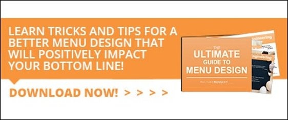
If you answered yes to a number of these questions then it's time to consider your options to invest into menu design. Take advantage of our guide to menu design by clicking on the image below. This guide will offer an outline of marketing factors considered by menu planners, 4-step process of your menu design, 10 vital tips when creating your menu, common menu mistakes to avoid and menu design factors.
Download our FREE guide to restaurant menu design below:
