
Cutting-Edge Marketing to Grow Your Business.
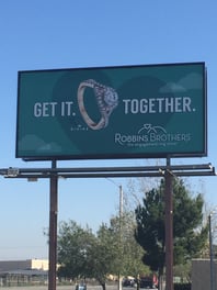 Outdoor advertising is a tried and tested method for grabbing the public’s attention. When successful, a good ad quickly gives needed information and sticks in the consumer’s subconscious. Conversely, a poorly designed billboard doesn’t present a clear message, is forgettable and wastes advertising dollars. So how can you avoid the latter and capitalize on roadside opportunities? Let’s look at some less than stellar advice to determine what not to do.
The more is better approach can be great in certain situations. Not for billboard ads. Try to steer clear of using too many words, which clutter the space. If the consumer can’t read all of the message or is confused by the sheer volume of information presented, your ad is ineffective. Stick to the basics you need to convey and make the statements clear and concise. Most drivers spend about six seconds reading a billboard, so have others read your copy in this length of time, before rolling out the newest campaign.
Imagery is always important and, in certain cases, will make the biggest impact, but unrelated or inappropriate images can completely undermine your ad campaign. Images should be able to stand alone, with very little interpretation from the audience. Clever is good, but too much can backfire. If consumers don’t get the joke, you end up being the punchline.
>>Check out how we helped one of our clients with their rebrand!
Just because a national ad campaign has been a hit and people will recognize the reference doesn’t mean you should emulate or copy their winning formula. This tends to make your billboard design seem far less creative and professional. Look for options which will relate to your products and show your originality.
Bright colors can be eye catching, but overuse of multiple colors or use of clashing colors will be more off-putting to the target audience. As stated earlier, bold and clear are the best options to quickly catch attention and deliver the message. Also, make sure your font color isn’t lost in the background color. The greatest contrast should be between font and background.
Not all consumers are after the same thing and not all personalities agree on what they like, so why would you attempt to advertise to everyone with one ad? Narrow the focus to an actual target. Then, if you want to attract a different group, design another ad campaign for that particular audience. Not only will you hit the mark more often, but consumers are more likely to see your approach as personalized to their needs.
Billboards are some of the most widely viewed advertising mediums. For brand building, they are extremely beneficial. And they continue to be used, to great effect, year after year. Even with increased competition from internet and television, billboards still convey messages and capture and retain customers year after year, if done right. Plus, billboards themselves are becoming integrated with technology (think-electronic billboards) and continue to stretch design boundaries with 3-D imagery and extremely creative and fresh designs. Make sure you’re not stuck in the past with poor design and execution. Just because the medium has been around for decades doesn’t mean your approach should be decades old, as well.


Lorem Ipsum is a simple dummy text used as a dummy text contents. Lorem ipsum will be replaced. Lorem Ipsum is a simple dummy text used as a dummy text contents. Lorem ipsum will be replaced.Lorem Ipsum is a simple dummy text used as a dummy text contents. Lorem ipsum will be replaced.


