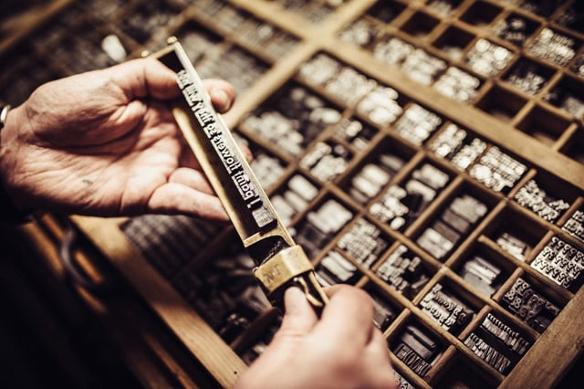
 As I listened to Jason Santa Maria’s discussion on typography, one of his specific observations stood out to me the most. He wasn't afraid to admit that typography is difficult. You might be asking yourself why this statement caught my full undivided attention. For one, my personal experience in college and two, every designer I’ve ever spoken to, agrees. When putting typography into the context of design we have to take into consideration the style of the typeface and really choose one that goes with the style of the design.
So, what makes a good or bad typeface? To a non-designer, type blends together. Coming from a graphic designer's stand point I can't help but notice even the simple things. For example, have you ever noticed when driving on Ball Road to Disneyland half of the buildings are using the papyrus font? Call me crazy, but designers understand that papyrus just isn't the proper font to be used for signage.
“the term readability doesn’t ask simply can you read it?’ it asks, do you want to read it?" - Jason Santa Maria (@typographica)
I can't tell you how much I admired this quote! It's very true! Say you take notice to a post on Facebook that's literally a paragraph long, is it fair to say you're most likely not going to be interested in reading it? On the contrary, let's say the post had imagery and very little text with highlights of the key points, then you might actually read it.
Typography is everything in terms of what you are designing, It’s about the style and the reaction you receive when someone looks at your work. You want the type to do the talking for you. It's not meant to cause viewers or clients to wonder.
Jason Santa Maria's tips for how to look at type:
1.) Look at the types inherent rolls, is it for display or long bodied text?
You want to use a workhorse typeface, which is a typeface family that has plenty of weights and design. This way you will be able to make use of the header and body copy since it's easier on the eye.
2.) Contrast in quality
Limit the amount of objects in a design. A full cluttered piece may look great in the end, however, you have to question, is it ultimately too much for the viewer? Bigger is better in terms of contrast and hierarchy. Allow your design to have headers, sub-headers and not necessarily all body text. Big defines small with type and the content defines the white space. When you have long lines of text your eyes need more kerning between the sentences to be able to easily read the content. Whereas shorter lines of text need less space to be able to be legible.

3.) Avoid ready made fonts
Fonts that are specifically made to be used for something without much thought to them.
4.) Develop a personal font pallet that you will frequently go back to for your work.
This cuts time in half when searching for fonts. Also, it's easier when you're already familiar with certain fonts since you've used them in the past. Utilize sans serif and serif font family for hierarchy. Be sure to use workhorse typefaces.
5.) Your font choices can make a huge difference in a piece
You have to look at the history of the font, the year it was created, the timeframe in which it was made and the content it was intended for. It can make a difference with the context of a piece.
As Jason Santa Maria once said:
“The best type has personality, but not too much to distract you from the design.”
About Jason Santa Maria
Jason Santa Maria is a graphic designer from Brooklyn, New York. He is the current Creative Director of Typekit, a faculty member in the MFA Interaction Design program at SVA, the Vice President of AIGA/NY, the founder of Typedia, and Creative Director for "A List Apart." - via Vimeo (34178417)
Conclusion
If you're experiencing difficulty with typography you're not alone. Nevertheless, no matter how challenging typography can be, in graphic design it impacts how people view your document. Typography is known to be a combination of art and science with a functional purpose. Do not allow it to intimidate you.


 As I listened to Jason Santa Maria’s discussion on typography, one of his specific observations stood out to me the most. He wasn't afraid to admit that typography is difficult. You might be asking yourself why this statement caught my full undivided attention. For one, my personal experience in college and two, every designer I’ve ever spoken to, agrees. When putting typography into the context of design we have to take into consideration the style of the typeface and really choose one that goes with the style of the design.