Cutting-Edge Marketing to Grow Your Business.

How do you choose fonts and colors that fit your restaurant branding? That's a question many people ask when it comes down to starting their company. Colors are what is going to represent your company visually, it is going to be the first impression of guests before you even get them in your doors to try your amazing food. So, a lot of thought must go into choosing these colors.
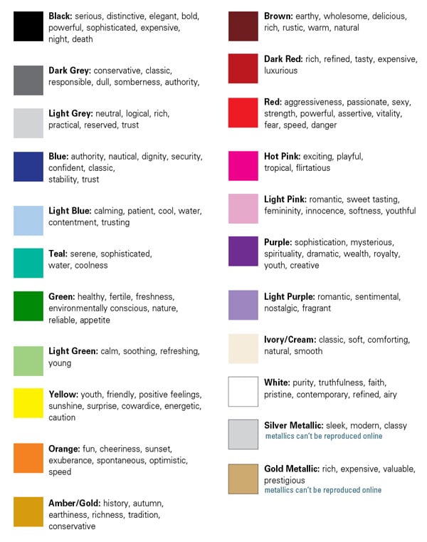
For example, in terms of color just think of the following companies and how their color choices work. With Target its known for its red bullseye, Apple is known for its metallic silver apple, and Best Buy with its big yellow tag. Each color conveys a different meaning and you want to be sure that your colors are giving off the right type of emotional meaning for your brand. Below, I share a list of colors and tips on what they represent.

Use colors that are complimentary of each other - you don't want your colors clashing because it will ruin your brand.
Don't choose bright neon colors - you want your clients and consumers to enjoy looking at it not have them looking away because its hard to look at.
Your brand should look just as good in greyscale and all white as it does in color. (Your logo won't always be able to be used in color your going to need different options to choose from based on your background.)
Use colors that evoke the right feeling for your restaurant - Think about details like what type of cuisine will you be serving? Is it from a specific country? Is it fresh from the farm? Is it fast food where you need to be quickly recognizable?
Fonts are very similar in the sense that they are so important to your restaurant branding. One major thing to remember is make sure you're not choosing a font that is similar to your competition. You want yours to stand out from the competition but you also want it to be readable, so chose fonts that are easy to read at a quick glance.
If you are considering a rebrand, here's 101 reasons why you should go for it.

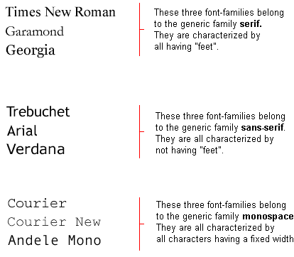
Type of Font – There are thousands of fonts to choose from – above shows examples of 3 types but there is also other types such as display and handwriting.
Scaling – How narrow or wide do you want your font?
Spacing – Sometimes the correct spacing can make a bad font look good
Case – All caps? All Lower case? Or mixed?
Style - Modern? Serif? Sans Serif? Handwritten?
When considering the above questions when choosing your font and colors for your brand, it's important to keep in mind that not every company is the same. You have to figure out what you want your company to represent. McDonalds wouldn't be as memorable without its golden arches and Wendy's would be nothing without its little girl. You want your brand to be memorable not forgotten.
In conclusion, choose colors that complement each other and a font that will bring your message home. Avoid using clashing elements with color and avoid using too many different styles of fonts. Keep it simple. When creating your brand the term "Less is more" couldn't be more true. Happy designing.
If you are currently struggling with your brand and looking to rebrand contact us today. We'll be happy to help (951) 479-5411.
If you are considering a rebrand, here's 101 reasons why you should go for it.


Lorem Ipsum is a simple dummy text used as a dummy text contents. Lorem ipsum will be replaced. Lorem Ipsum is a simple dummy text used as a dummy text contents. Lorem ipsum will be replaced.Lorem Ipsum is a simple dummy text used as a dummy text contents. Lorem ipsum will be replaced.


