We live in a world where simplicity reigns, where we are constantly attempting to update the outdated and push the envelope to begin that next big trend. With technology and the way we receive information, brand design is constantly evolving to take advantage of the newest technology available. In recent years, you have watched your favorite companies such as Pepsi, Stub Hub, Pizza Hut and more make changes to their logo design bringing them up to the next level. This year, back in April, American Express did just that with the help from Pentagram partner, Abbott Miller. At first glance, the American Express logo redesign is not necessarily noticeable. This is because Pentagram made the change so subtle that it's almost hard to tell.
Very quickly, before we go into full force on the logo redesign, let's get into Pentagram and Abbot Miller. Pentagram is the world's largest independently-owned design studio known for their good designs. Their works range from product packaging to exhibitions and installations, and everything in between when it comes to print and web. Built up of 20 partners ranging from London, Berlin, New York and Texas, these wonderful artists are all practicing designers. Abbott Miller, who has been a partner of Pentagram since June 1999, pioneered the concept "designer as author" according to his bio, "undertaking projects in which content and form are developed in a symbiotic relationship." Miller is also a graphic design teacher at the Maryland Institute College of Art in Baltimore.
Hire the right graphic design studio with this checklist. Download here.

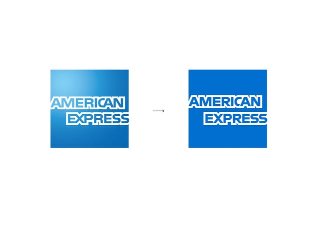 American Express' last logo rebrand was in 1975! It's been 43 years since they introduced the blue box into their logo. So, what exactly did the new 2018 rebrand of AMEX bring? As mentioned earlier, you might've not noticed. It went from a blue box with a gradient shine in the top left corner to a blue box with no gradient shine. Miller is quoted mentioning, "they didn't want people to say, oh, did you see that new logo 'ugh'," they wanted a clean subtle change that'll have us saying, "hmm, is this new or are my eyes deceiving me?" Your eyes are not playing tricks on you. It is in fact, a new design from the blue box to the text itself.
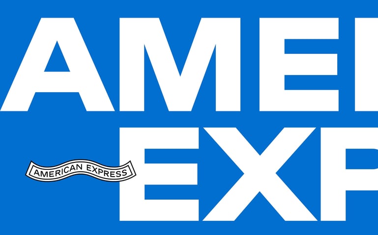
The text changed ever so subtly where it is most noticeable in the "C & A" in American and in the "R" in express. With this re-imagined use for type it allows the font not only to be used as just a stroke but also there is another version that drops the stroke and focuses solely on the negative space wordmark. This couldn't be done before because when it was designed back in 1975, it was only designed to be a stroke typeface. So, once the stroke was removed you just didn't have a wordmark at all.
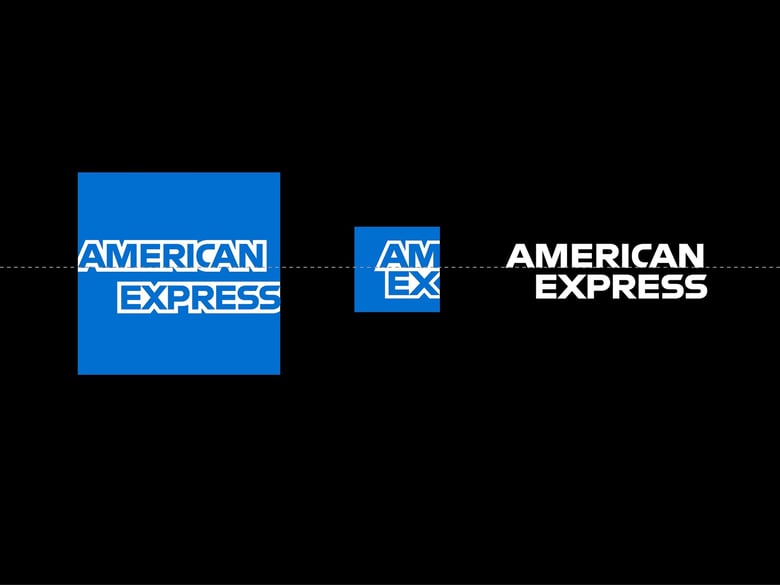
What the team of Pentagram also did was make it more suitable when it comes to using it in the UX/UI design form. By just having a monogram of the logo with only the use of "AMEX" it allows the logo to not only be recognizable but it's now user friendly as well.
But is that all Pentagram changed? They also redesigned the "Centurion" image that is located on your AMEX credit card. Making it more simplistic and modern allows it to be placed on a darker background in a cleaner manner than the original one allowed.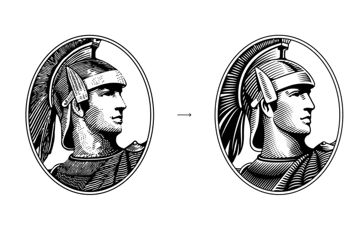
In conclusion, I think the American Express logo rebrand is wonderful. Especially, when it comes to readability and controls. The wordmark itself allows for more creativity and simplicity among their pieces. This is a well done rebrand by the team at Pentagram and Abbott Miller.
Let us know your thoughts of the AMEX redesign at the comments below.
[All images curtesy of Pentagram]
Looking for designers for a logo rebrand? Contact us today for more information on our design services (951) 479-5411 or email us at info@kulturekonnect.com with any questions.
Hire the right graphic design studio with this checklist. Download here.