Cutting-Edge Marketing to Grow Your Business.
 We live in a world and age where people need answers and solutions to their problems, and they want them now. Today, most people look for solutions online, and they will click the most appealing ad on the first page in the search results. However, if they click on your ad and the landing page they arrive at is not properly optimized, they will leave and might never come back.
According to a study conducted by the marketers from WordStream, small business owners spend an average of $1,200 on PPC campaigns, but they waste 25% of that budget due to managerial and strategic errors related to their landing pages.
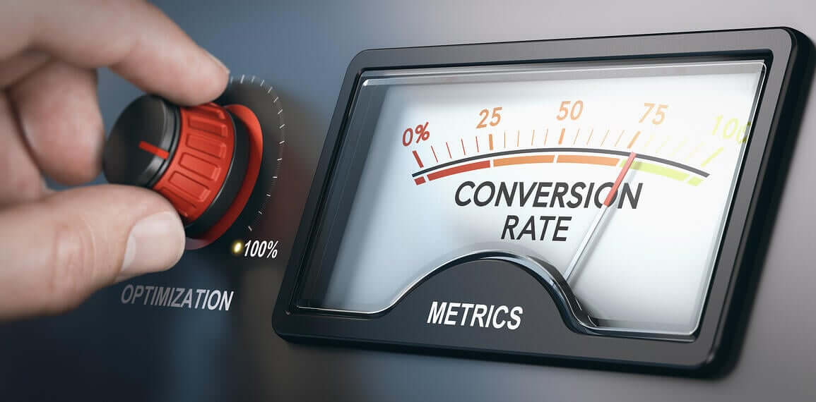
Even though there is no perfect formula to create a flawless landing page, there are certain some steps you can take to ensure that your landing page structure will not disappoint. Here are the top 7 easiest ways to optimize your landing page structure and boost your conversion rate.
First and foremost, you need to ensure that your landing page is mobile friendly. Mobile users are even more difficult to understand than desktop users, and their number is growing exponentially. Try your landing page on several devices and multiple browsers to ensure a streamlined navigation process for as many people as possible.
There is a whole debate in the marketing world on whether a landing page structure should contain navigation bars. Truth be told, including a navigation bar at the top or bottom of your squeeze page might make it quite easy for your site visitors to visit another page on your site or leave.
It is much better not to include a navigation bar, especially if you want to make sure your page visitors are going to be focused on the call to action. You can easily remove the navigation bar on a WordPress site by going to the page properties, advanced settings and checking the “hide navigation” box.
In case you are still using the standard “Submit” as your call to action (CTA), it is definitely the right time to rethink your CTA strategy. Understand that a call to action can mean the difference between a valuable conversion and a quick bounce. Some examples of good call to action messages include: “download today and change your life forever”, “I want to grow my traffic” and “I want to boost my conversions”, just to name a few.
According to Jakob Nielsen, most page visitors are similar to frantic, wild animals who are simply looking for a quick meal. To serve it fast to them, make sure to use right fonts and colors to indicate information hierarchy. Consider adding enough visual cues to help your visitors navigate on the landing page, and gently guide them towards your CTA.
Power words can take your message and make it irresistible for your prospects. Power words such as confidential, safe, regain, secrets, hidden, forgotten, behind the scenes or banned, can give a whole new appeal to your message.
As a quick example, let’s say you offer security camera services. As a title you could use “Make your home feel safe again”. The last word, again, is very powerful in this context, implying that the home used to be safe, but it isn’t anymore. The solution for your prospects is to choose your service now and enjoy safety once again. And to make the title even more power throw in hook... "6 Proven Ways to Make Your Home Feel Safe Again".
Many marketers focus solely on the forms need to ask on the landing page, and do not consider if they should be simple or complex. Usually, it is better to have simple forms because it makes it easy for prospects to download your free eBook, subscribe to your newsletter or register to the webinar. Nevertheless, you should also do some A/B split testing to determine if simple forms work best for your prospects.
Including video on your landing pages can be extremely powerful and can dramatically increase your conversion rate, especially if you are trying to convey multiple complex ideas and you want to save the precious time of your prospects.
That does it for our 7 landing page structure optimization tips. If you have already experienced success with one of these strategies, we would appreciate if you would share it below. If not, try one of them and tell us how it went for you.


Lorem Ipsum is a simple dummy text used as a dummy text contents. Lorem ipsum will be replaced. Lorem Ipsum is a simple dummy text used as a dummy text contents. Lorem ipsum will be replaced.Lorem Ipsum is a simple dummy text used as a dummy text contents. Lorem ipsum will be replaced.


