Cutting-Edge Marketing to Grow Your Business.
 Billboards are one of the most famous outdoor advertising techniques used by marketers in order to communicate their product/service/message to motorists and pedestrians. The fact that companies are still working and spending a filthy amount of money on this medium explains for itself that it still has a decent amount of viewership and induces action too.
But not all billboards are the same. Some get great results. On the other hand, others don’t even make a slight impact on profits. That said, there are things you can do as a marketer to ensure the effectiveness of the billboards your organization puts up.
For example, frequency of presence needs to be kept in check depending on the brand. Even more challenging is billboard design. Overall, there are three major obstacles that are faced by this mode of advertising which restricts its viewership. These need to be dealt with effectively.
Billboards have limited space. Sometimes, it become impossible for onlookers to go through every word that is written on the billboard because they’re driving their car or riding a bus when the billboard comes up, this results in avoidance of the entire content. On average, billboard viewership does not last more than 4 seconds so it’s better to come up with an advertising message that’s as precise as possible. 8 words or less that can be read easily are the most effective.
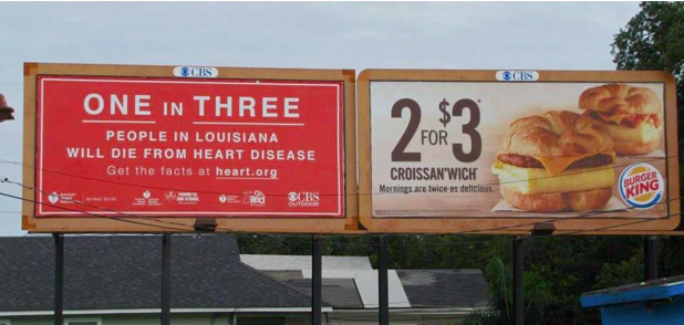
Bad billboard placement not only hides away your message (behind trees or buildings) but also leaves the viewers confused if it is placed next to a contradictory message on another advert. How would it sound if a crash diet plan is placed next to a high-carb meal on discount?
Choose the placement for your promotion wisely. Both are key ingredients in your marketing mix.
Unclear messages are automatically discarded as the viewer may consider them as ‘not for me’. Creativity is an integral part of advertisements, however, while designing an ad message it’s better to keep it relatable especially for billboards because there isn’t enough time to ponder over the depth of the message. A clear headline and a strong affiliation of the message with imagery can promise brand resonance.
Advertising content needs accuracy and meticulous effort in designing it. Both, clarity and precision go hand in hand which is really an art in itself. Master it as a marketer to create catchy billboards that bring in results.


Lorem Ipsum is a simple dummy text used as a dummy text contents. Lorem ipsum will be replaced. Lorem Ipsum is a simple dummy text used as a dummy text contents. Lorem ipsum will be replaced.Lorem Ipsum is a simple dummy text used as a dummy text contents. Lorem ipsum will be replaced.


