
Cutting-Edge Marketing to Grow Your Business.
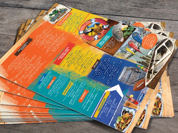
Running a restaurant is about making great food but a huge factor that contributes to success is how the food is presented. Of course, so many elements play into the performance of your restaurant marketing. The goal is to get people comfortable and intrigued as soon as they walk in the door. Attentive service and a captivating ambiance are essentials in accomplishing this; however, one of the most influential aesthetics of a restaurant is its menu. It guides the customer in their decision, and you want them to be excited about whatever they end up choosing. Think of a menu as an advertisement. It needs to showcase the benefits of your product and just as importantly be symbolic of your carefully constructed brand. Menus are the best kind of ad because they can’t be ignored. Make this experience an enjoyable one instead of a mandatory interaction.
Kulture Konnect has provided the following twelve menus as examples of outrageously creative menu designs. These menus were chosen because of the effectiveness of creativity and on how well the menu complements the existing theme of the restaurant. The various designs showcase a culmination of systematic layouts, carefully constructed color schemes, and expressive font and font sizes.
All items are categorized neatly and the small food icons give the menu a quaint look, complementing the vibe of the vintage theater.
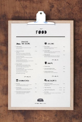
The grid layout does a great job and the brightness suggests the food will be just as vibrant.
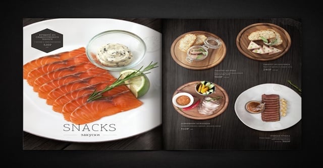
The warm colors featured perfectly complement the rich tones in the food. The result is a bold and enticing visually driven menu.
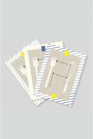
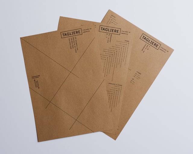
This Italian-American restaurant has created an innovative menu with one font and two colors. The dual language feature cleverly incorporates their brand “Italiani in America”.
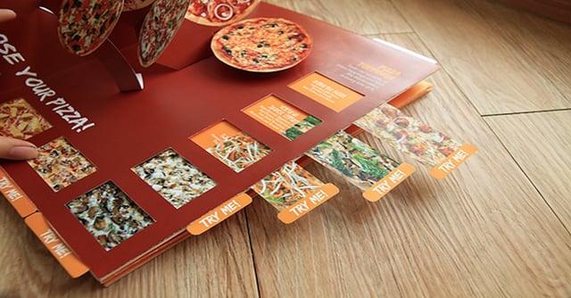
This is so fun because it’s so interactive. Its design models confidence in the quality of the food and pop-ups are just plain fun!
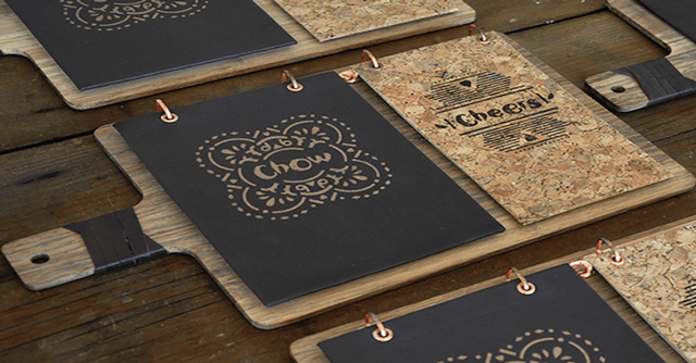
 6. NANDO'S CHOW & CHEERS MENU
We love this because it is so far removed from a traditional tri-fold menu. There is a lot going on but the design is engineered for efficiency, and it totally achieves!
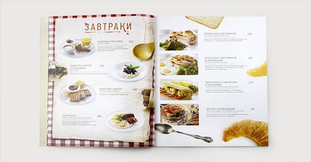
 7. PESTO CAFÉ MENU
This menu does a wonderful job of incorporating vibrant colors. The extra information it provides gives the reader a chance to invest in the restaurant’s unique outlook.
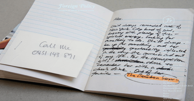
 8. 13 Wives
This menu is so clever because it focuses on the inspiration of the drink rather than the ingredients, making not only the drink memorable but also the bar.
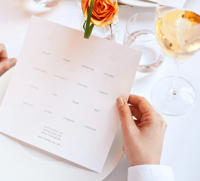
 9. ELEVEN MADISON PARK
This is a perfect personification of personality. The super minimalistic approach relies on the reputation of the sophisticated quality of food and service of the restaurant.
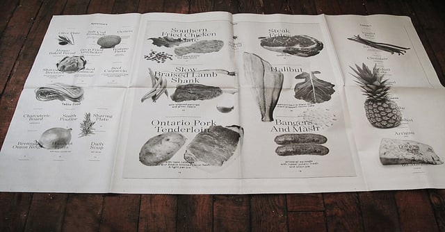
 10. SMITH
This newspaper menu is multifunctional as it doubles as takeout wrapping making it decorative and also efficient.
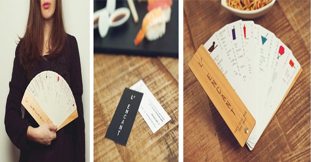
 11. L'ENCANT
This fan-out menu is a fun and innovative take on menu design. Its interactive features allow the customer to truly curate their meal.
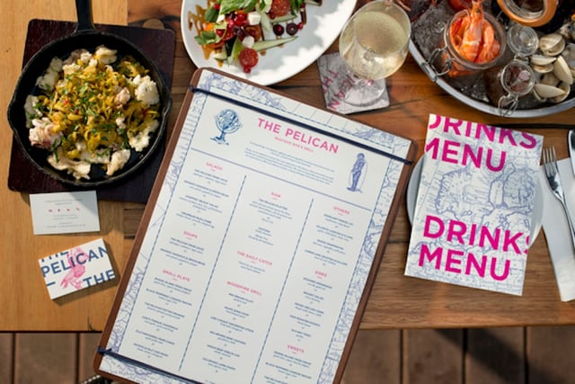
The presentation of this menu mimics the way the food is presented, making the entire spread symmetrical and aesthetically pleasing. Great for pictures!


Lorem Ipsum is a simple dummy text used as a dummy text contents. Lorem ipsum will be replaced. Lorem Ipsum is a simple dummy text used as a dummy text contents. Lorem ipsum will be replaced.Lorem Ipsum is a simple dummy text used as a dummy text contents. Lorem ipsum will be replaced.


