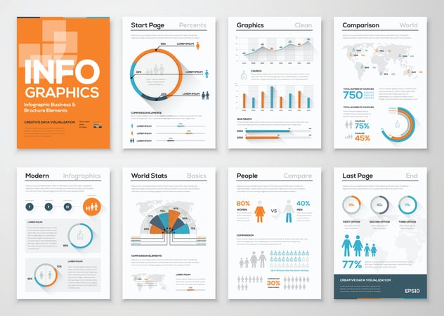
Cutting-Edge Marketing to Grow Your Business.

Ever wanted to use infographics, but had no idea on how to get started? Keep reading and discover how infographics can be used to put your social media content front and center.
What is an Infographic?
Simply Measured mentions that visual content drives engagement, and with the help of visual images, readers have a higher probability of remembering your post than with simple text.
An infographic helps to represent complex data and information in a “simplistic” manner through graphs, diagrams, icons, timelines, text, illustrations and more. A well designed infographic will allow you to tell the story of your data in a more engaging way by using imagery as a tool while staying focused on the actual message.
Why Should I Use Infographics for my Social Media?
According to Hubspot, infographics are "liked" and shared on social media 3X more than any other type of content. This translates in audience growth and engagement, which, ultimately, will allow you to get more backlinks, enhance your brand recognition and improve your Google rankings. Naldz Graphics summarizes in a few words why infographics are important:
Makes info more appealing
Shows valuable ideas
It is attention grabbing
It is easier to understand
Lessens boredom
Awakens one’s interest
It is accessible
It is more persuasive
It is memorable
Can easily relay information
But, creating an infographic just for the sake of the trend can also be dangerous. If you decide to use infographics as marketing tools, they can’t be standalone components. They need to be an integral part of your overall marketing strategy. Also, like any other marketing initiative, when creating infographics you need to say “no” to quantity and be willing to aim for quality. This means that it is better to have a single, very strong infographic in terms of design and content, than ten irrelevant pieces.
>>Amplify your brand with these 24 free Facebook Covers here
Here are 4 easy ways to design an infographic:
1.) Flow - Have you ever come across a design that is visually unclear and doesn’t tell you where to look first? Most likely, such design didn’t have the right reading flow or pattern. When designing, certain things can be done to help the users’ eyes navigate the information that is being provided. One useful technique, especially for infographics, is the use of leading lines. Check out this infographic by No Pork Pies. It uses a dotted line to clearly and softly guide the users’ eyes from point A to point B and so on.
2.) Timelines - This type of organization allows for a more linear narrative of your information, which makes it very easy for the user to identify and follow a reading pattern. A good use of a timeline is when you have to explain the history or evolution of something, or simply when you have to structure a lot of information in an easy to manage order. Check out this interactive infographics by Akita to get a better idea of using a timeline.
3.) Data Representation - Normally, infographics deal with a lot of data, and presenting such information as a series of pictorial representations can make things way less intimidating and, actually, more engaging. Check out this infographic by Fast Company that gathers and condenses data into very easy to understand data representations.
4.) Comparisons - Another good way to design infographics is by creating comparisons. This approach can be used to compare two products side by side and create visual contrast among the different design elements. Comparisons give you room to appreciate both sides of the coin while developing a candid understanding of the given argument. Check out this infographic that shows a clear comparison with a well arranged layout and color coding.
Conclusion
An infographic gets rid of any margin of data misrepresentation, which allows for less data misinterpretations. Facts and figures can normally have your head looping around, but the use of infographics and a good representation of facts and figures will ultimately allow you to create an effective social media infographic.
Are you seeking marketing or social media professionals? Learn more about the industries we've worked with here. Contact us here for more information.
Visit our portfolio for a glimpse of our work here.


Lorem Ipsum is a simple dummy text used as a dummy text contents. Lorem ipsum will be replaced. Lorem Ipsum is a simple dummy text used as a dummy text contents. Lorem ipsum will be replaced.Lorem Ipsum is a simple dummy text used as a dummy text contents. Lorem ipsum will be replaced.


