The internet is overflowing with an astronomical amount of websites that anyone can access. I've taken some time to visit two subreddits: worst websites and bad web design and oh boy, did my eyes hurt after a few minutes of browsing!
Let's take a closer look at 5 of the worst website design fails I've seen so far from the subreddit. But before going further please be warned:
Disclaimer: These are my personal (and to some extent, the OPs on reddit) opinions only! I have no intentions of inflicting emotional harm on the owners, developers, designers and anyone that may be affiliated with any of the websites below!
With caution, individuals with epilepsy, be warned! The images below may feature colors and animations that could increase the chances of a seizure.
With that said, let's get started!
1. Modern Sky Festival
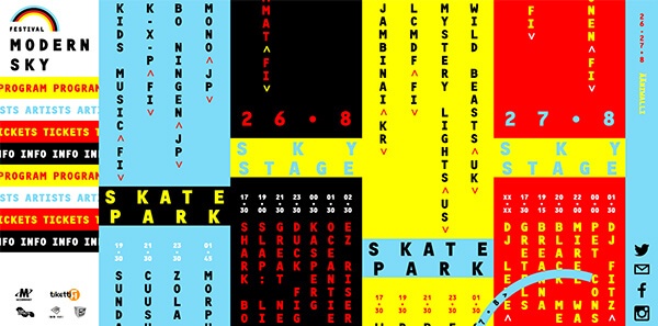
My first pick, Modern Sky Festival. Their website takes you to an intro page wherein lies a YouTube video with a low-resolution thumbnail and a button that will take you to the actual homepage. You will need to visit their website first, before you can go to their website. Lovely!
Moving on, we are taken to the actual home page. The site utilizes the tried and tested three-column layout; the navigation on the left, content in the middle and a thin sidebar on the right. However, I cannot quite say the same for the content. Here's why. The navigation confused me as the words were repeated over in a sort of infinite-scroll look. The idea is taken a step further on the middle column where a further four-column layout lies within. Try scrolling your mouse and prepare for innovation as two of the columns will scroll in the right direction and the other two in the opposite, in alternating fashion! Overall, the site's choice of colors and odd presentation wasn't very vision friendly and caused a slight headache.
2. Websites by Laurie
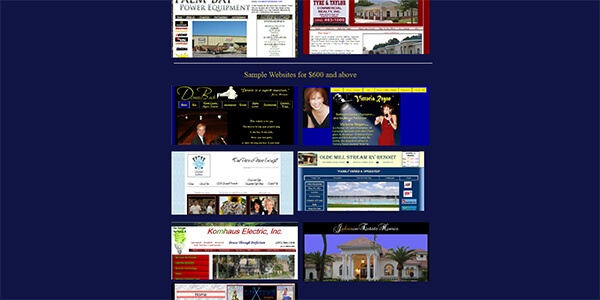
Second, I believe it goes without saying that if you build and create websites for a living, you need to live up to your knowledge and experience. Your website must be fast, aesthetically pleasing, responsive and give off this authentic feel to your visitors. I personally believe this site achieves none of that. Visiting the link, your eyes are greeted with a very old and almost fake kind of feeling. I will give the website credit for the autoplaying music, which compliments the experience.
The About Us page was the icing on the cake! The page features a lone video that mimics a Star Wars type of introduction with a unique take on the music, which was a bit depressing, almost as if someone just passed away! Yikes!
3. Singing Kids
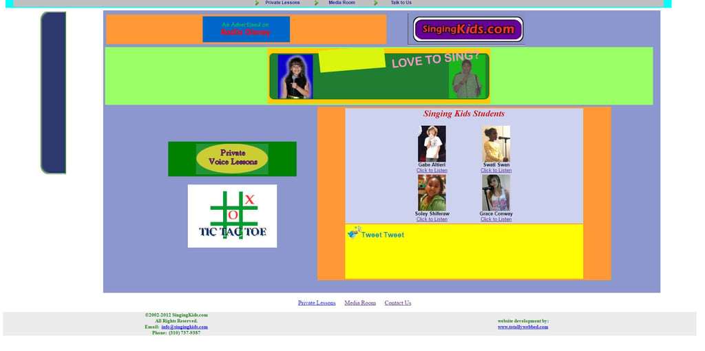
For the third pick, the only way I would have been able to forgive this site is if a child created it. Above, you will see the "As advertised on Radio Disney" banner that provides no way of verifying that it's actually true. With that element, the site's authenticity immediately becomes doubtful. They offer previews in the form of audio clips you can hear and the children sound nice. However, with only audio clips and no real information, you might not believe that children were present, but possibly students at some point.
4. Tru-Tech Roofing

Note: No link for this one as the site uses Flash, which may be dangerous, depending on your system configurations.
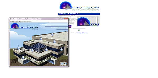
Ahh, another "enter the website" example. This one ups the ante by opening a new tab with the website presented in Flash. That's right-- Flash. After the loud thunder sounds, which I couldn't disable, almost made my ears bleed, and the intro finished; I was greeted with the screen above. I was at a loss on what to do next! My initial thoughts were that I had to click on the raindrops in order to "clean" the roof and therefore, be granted access to the website content. Turns out that the raindrops themselves were the navigation links! The landing page suggests a screen greater than 800 x 600, but if you open the Flash content up in even a 1024 x 768 screen, you'll find yourself slouching and getting close to the monitor just to read the text!
5. Ling's Cars
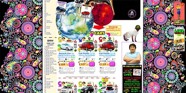
I'll leave this one in your hands.
The zenith of modern web design. This site packs a ton of information in a non-responsive design, with tons of floating, moving, blinking, overlapping and god knows what elements. The owner's face is plastered onto every part of the website. There is music playing and the site also has a personalized message at the bottom, awesome! It presents itself to be a car leasing service and after my experience with the website, I'm sure it will not be my first stop when I want to look for a safe, genuine and working car!
Advice for Building a Website
To build a quality website, we must put time and effort into the development. Understandably, sometimes we don't control the time or budget we put into when creating a website, but surely enough we must avoid having it turn out like the sites presented above.
One of the most important parts of development is the planning stage. Having a well thought-out plan will make sure that each step that follows will bring progress and value to your site. Of course, no plan can be successfully executed without the executioners. Make sure that the right tasks are assigned to the right people. This ensures that operations and tasks are handled as correctly and efficiently as possible by the most qualified members of your team. Communication is key. Any delays must be tackled together in order to minimize negative impact.
Be prepared and start strong from the get-go. Maintain the momentum until the end, do your research if necessary and you should have yourself a beautiful website that anyone can appreciate.


