Cutting-Edge Marketing to Grow Your Business.
It is an exciting time to be a part of... the dawn of a new decade! The year 2020 has already been showing signs of a great new era of graphic design. It is a time where designers are busting through the status quo and creating new and fresh designs. These are the top 5 design trends for 2020.
1. Monochromatic Images
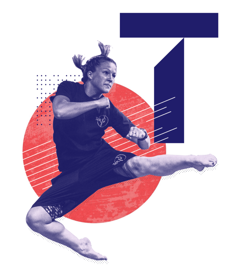
There was a huge craze of duotone images during 2018/19 that has transitioned to monochromatic imagery for the new decade. Overall, design is moving onto the very edge of fantasy and reality... so, removing the original color from the photograph helps to push the visual imagination past its limits.
Below, you will find a classic example of a purple-toned monochromatic image.

In the example below, two different monochromatic images were juxtaposed together. The abstract elements help to create depth between all of the pieces.
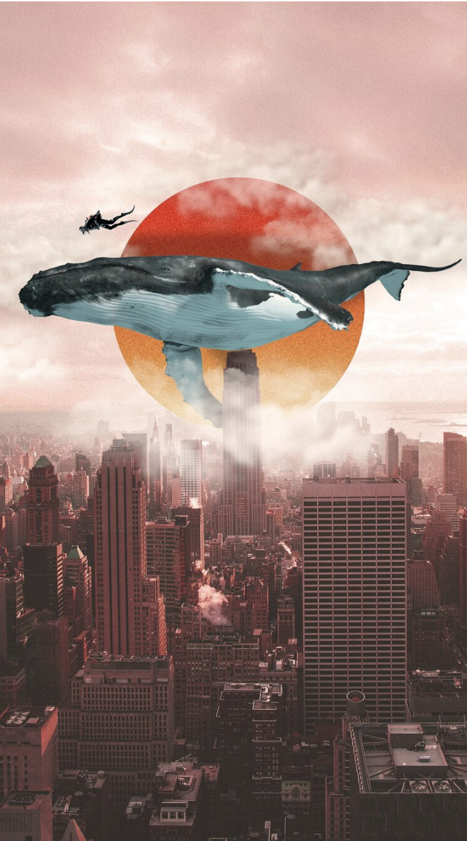
Take a look at the cityscape in the image below. The graphic designer converted it to a monochrome image giving the piece a surreal look and feel.
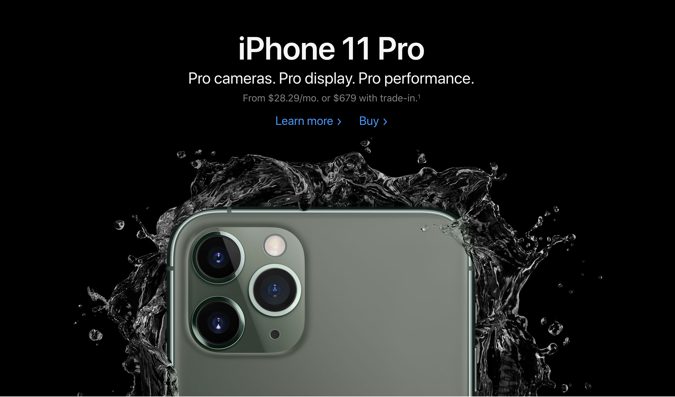
Apple is leading the monochromatic trend with their grey on black iphone imagery. Event the water splash blends into the black background with its beautiful transparency.
2. Simplified Gradients
Last year, in 2019, we saw tons of gradients in the background. These gradients were bright with multiple colors blending into eachother. Now, in 2020, we will be seeing much more simplified gradients. The gradients will be used in creative ways inside of an image instead of just as the background. They will be more muted colors as you can see in the examples below.
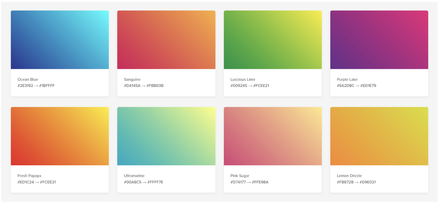
Take a look at how the gradient is used as a flowing art element from the two digital screens. The designer used muted colors and only combined a couple of colors together for each gradient.

This image uses simple gradients throughout the image in the water, the sky and the rocks. It makes a 2d image pop with dimension.

3. Muted and Neutral Colors
The shift from bright to muted will be in full force for 2020. The goes with the general theme of vintage for the new era 20's. I've even heard mentions of the roaring 20s! The mixing the old with the modern is definitely trending.
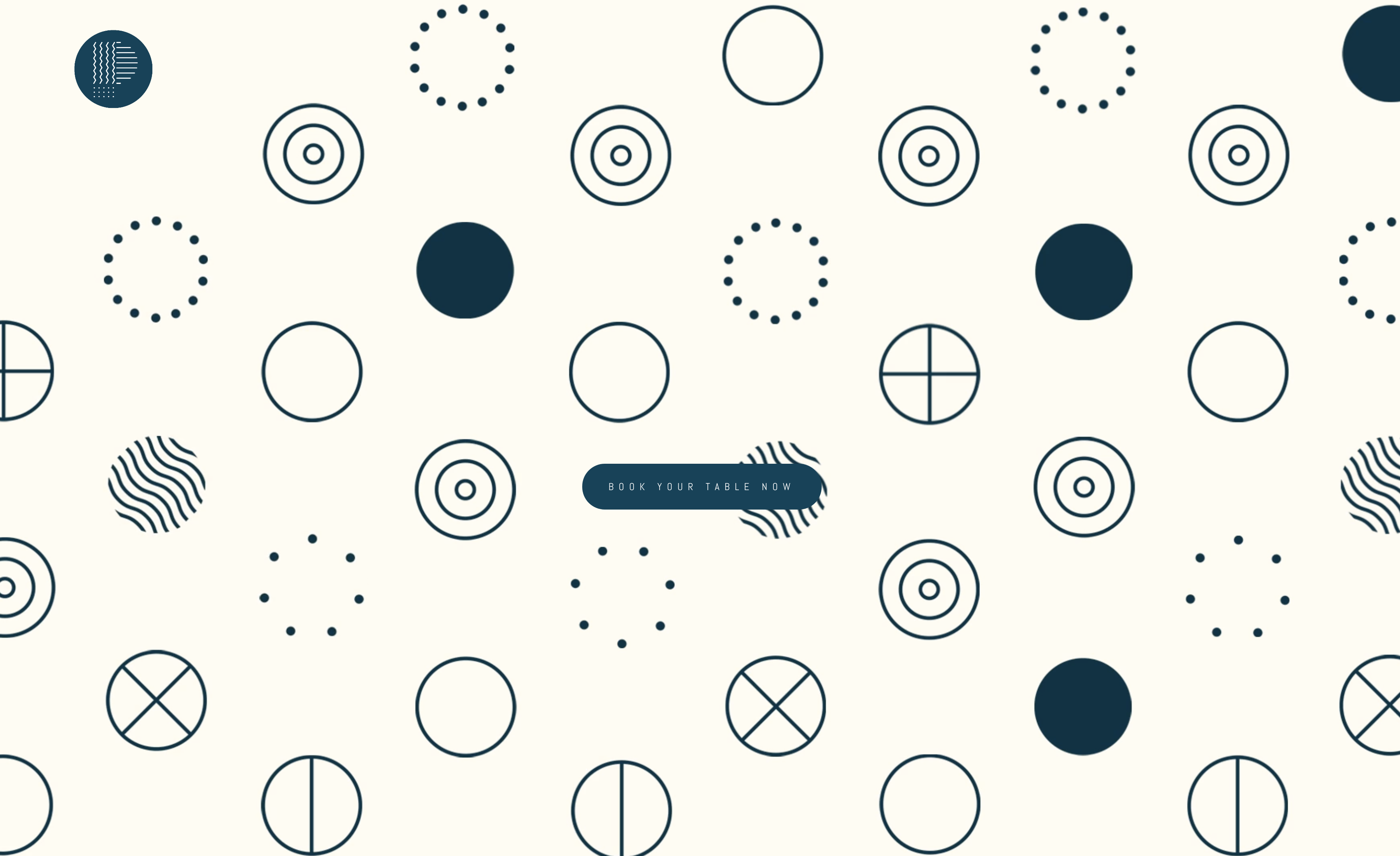
In the image below you will see the combination of muted blue with simplistic geometric shapes. This shapes creates a vintage feel that is eye-catching.
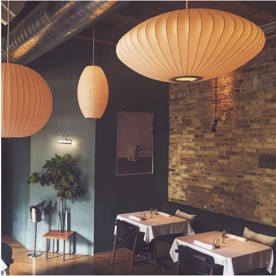
This is an interior of a restaurant. You will notice the muted color palette with the color of the wals, floors and lamps. there is a lot of this muted color palette in Instagram where there are filters that can change any color scheme to something more neutral.
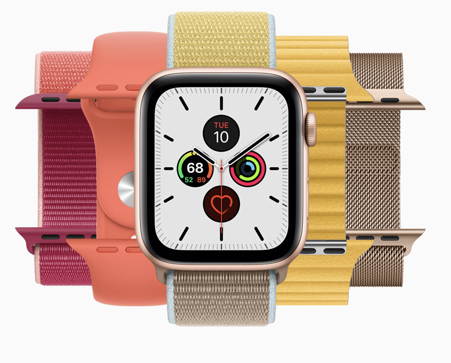
Apple is always on the edge of what is trending. You can see in their new releases of apple watches that the colors of the bands are muted and earthy.
4. Abstract Illustrations and Line Drawings
As AR technology advances more and more by the day, we see this juxtaposition of reality versus fantasy. Abstract illustrations are becoming very simplified in 2020. Line drawings will be seen more and more on packaging, magazines and billboards. It is easy to animate line drawings so they are being used extensively in digital marketing to catch the consumer's attention.
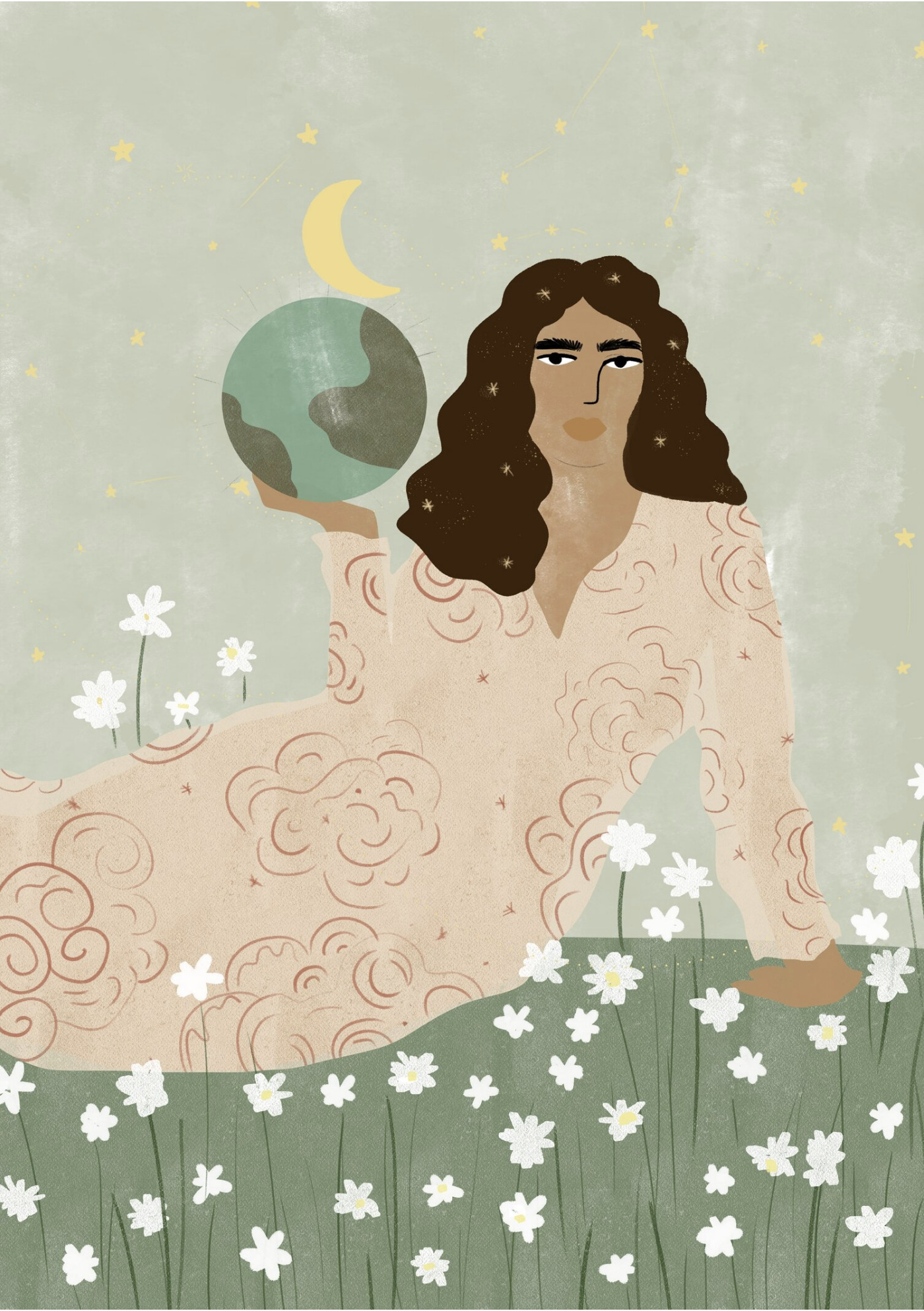
In the illustration below, you can see the muted tones of the over-simplified image of a woman sitting on the grass, holding a globe. Most all of it is in 2D and the muted color palette goes along with the current trend.
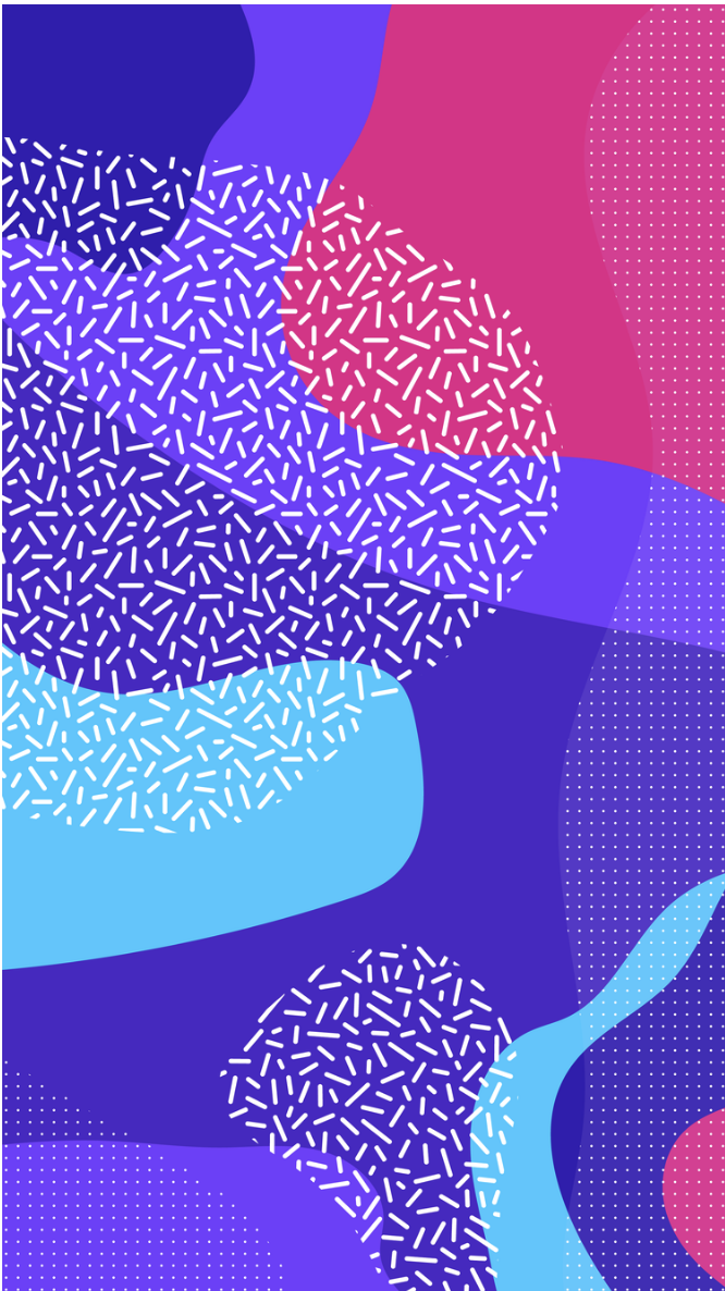
The pattern below is a good example of a simplified 2D illustration that shows depth through color and placement.
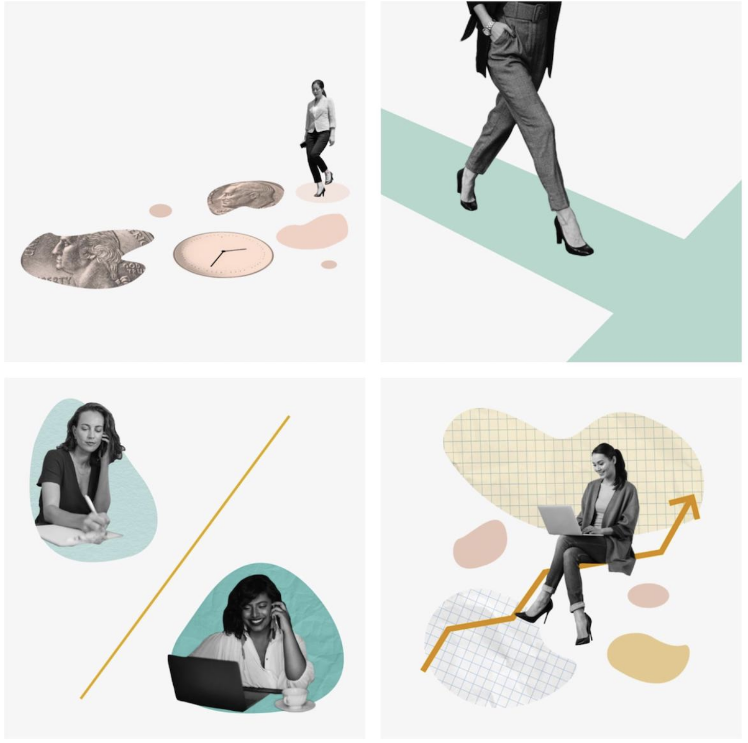
Below, is a perfect example of combining the real with the fantasy. For the women to stand out, the designer chose to put them in black and white and used soft, neutral colors to provide shapes that would create depth in the 4 scenes. This example also uses line art to draw the eye's attention to certain elements of the composition.
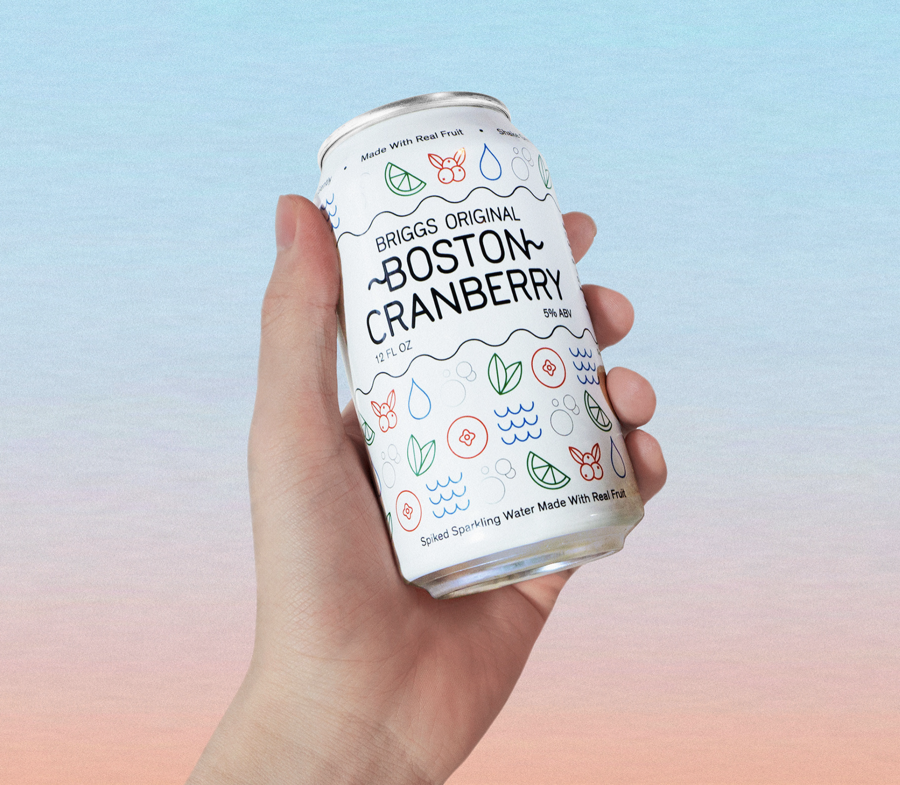
Below, you will find a prime example of the use of simplified line art in packaging design. The simplicity of the drawings convey the real fruit that is used to flavor this drink. These elements can also be used in their digital marketing strategy as an animation.
Again, here is an example of combining the real photography with the illustration. The designer added simplified line drawings to convey the message of the successful students on these two magazine covers.

5. Modernized Art Deco
Metallics are back with a vengeance in 2020. They are bold and they are shiny. Some say this trend is a nod to the art deco era of the 1920's but the mix of the new modernism really brings a new meaning to Art Deco.
The logo below for Coco Mood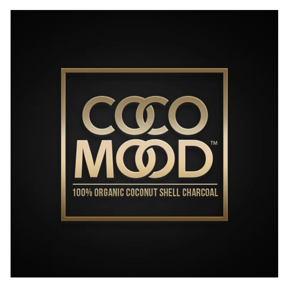
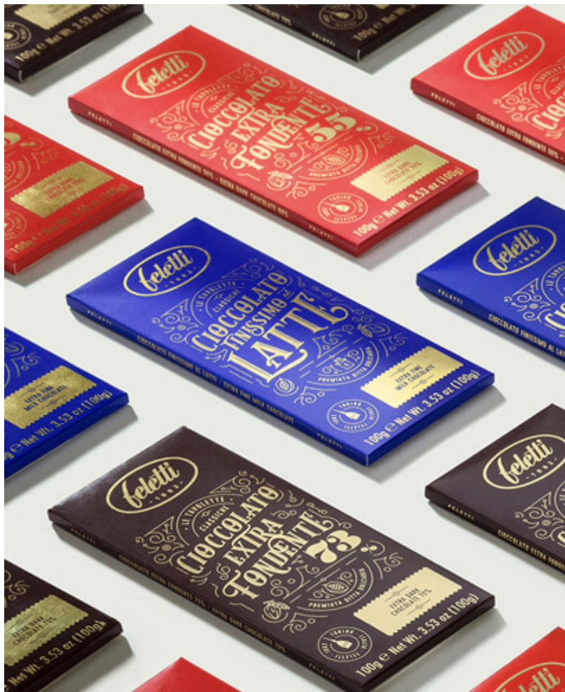
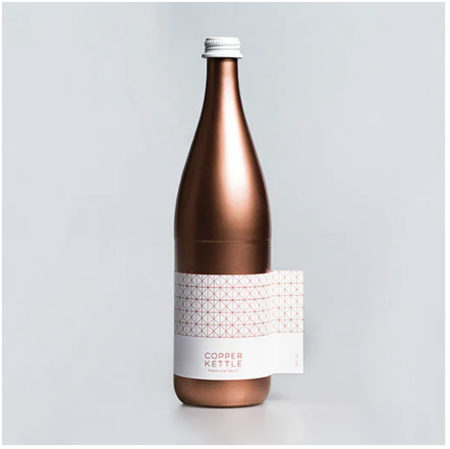
2020 is going to be a great start to a new decade for the branding and digital marketing world. We are lucky to be a part of it!

Design trends come and go, but no matter what there is always a new one brewing. When it comes to design you either have to stay on top of these trends or fall behind the pack. This is especially important to graphic designers and agencies who want to stay above current trends for clients who are looking for certain designs. But wait a minute...isn't design about being creative rather than following the crowd? Sure, you can ignore the trends, but that also puts you and your company at risk of not being able to advance in the industry.
While some trends remain each year, there are those that step out of the box and challenge us. We can't wait to see what else is to come.
So, what do you say? Let's dive into how we think the year will go in terms of web and graphic design this year.
Asymmetrical Layouts
Breaking free of the traditional grid style designs. These designs leave for interpretation. Allowing the designer to intertwine typography and graphics within each other. Being able to layout type creatively and not just in a traditional standard way.
Duotones / Gradients
While most people despise gradients done in the right way can be very beneficial for your work. Companies such as Apple and Instagram use them regularly.
Hire the right graphic design studio with this check list.
Use of Filters (Warm and Moody)
Social media influencers are perfect examples of using filters such as warm and moody tones. Their style of posts have caused a trend of its own. The use of warm and moody filters have caused brands to start following this style of editing.
Outlined Typography
No more fillings for some layouts when it comes to type! While it wont work for some fonts, try using a mix of solid type and outlined type to create texture within your designs.
Isometric Design
With infographics still being a prized target for getting information and statistics into the world. Isometric design has made a bigger impact in helping do this. Allowing designers to add depth in not only print design but web design as well.
Mobile First Design
With the number of mobile devices surpassing that of desktops and even people, it's no wonder web design as a whole has shifted to a mobile-first, progressive enhancement design and development flow.

Video Content
The rapidly growing demand for faster and more reliable internet means videos are becoming more and more common. As more social media platforms integrate video-related features, brands are increasingly becoming more comfortable using them as well.
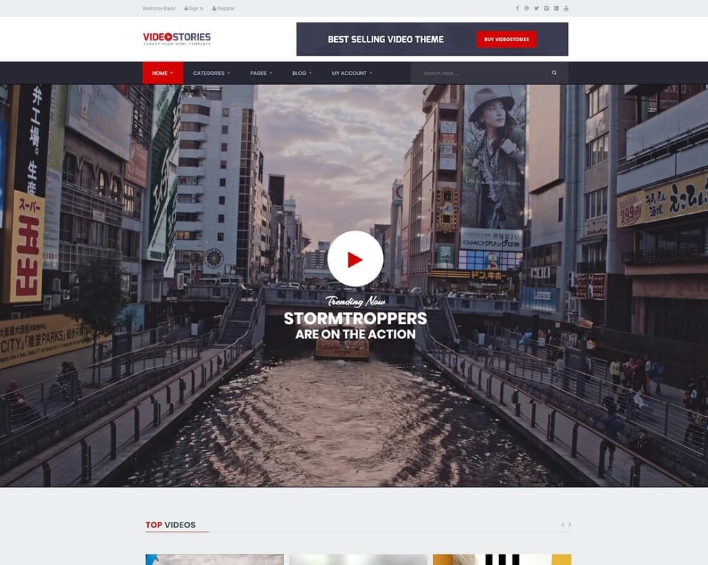
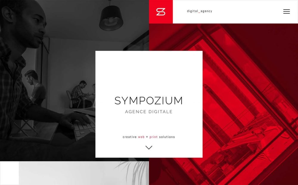
Inclusion of Fluid Geometric & Asymmetrical Shapes
A few years ago, the rise of popular grid-based frameworks made developing websites faster and less costly. This however, gave rise to numerous websites that basically looked and felt the same. Today, designers are using quirky shapes and asymmetrical layouts to standout from the crowd.
Animations
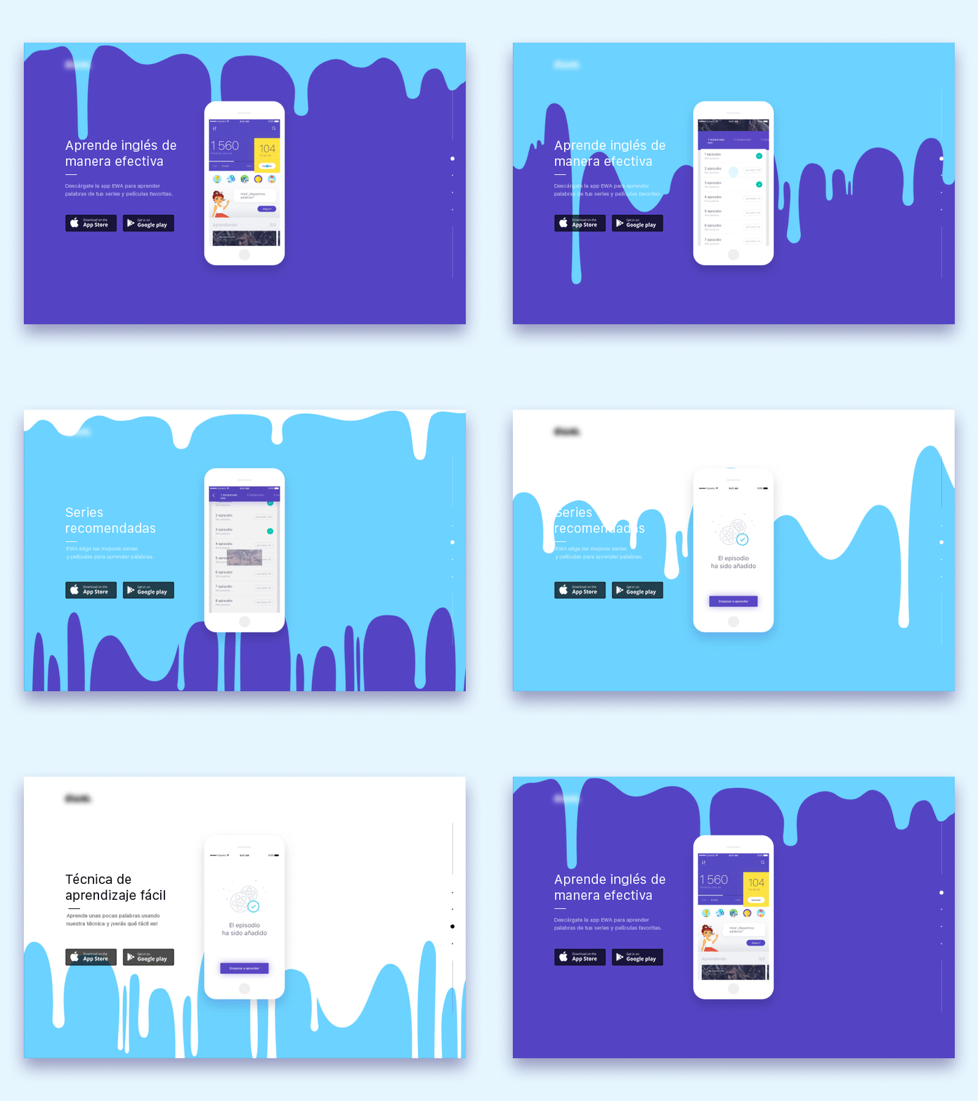
With even CSS alone allowing for some complex animations, they are now easier to create and incorporate to a website design. From small hover effects to page-wide moving backgrounds, animations can add fun and excitement to any website.
Overlapping Elements (broken grid)
Another variant of breaking off from the traditional grid systems of yore, overlapping certain elements can show off creativity and add life to your designs while also allowing you condense your elements into a more compact layout. And with hundreds of mobile devices coming out yearly, these are great for staying on top of whatever resolutions come out next!

Hire the right graphic design studio with this check list.
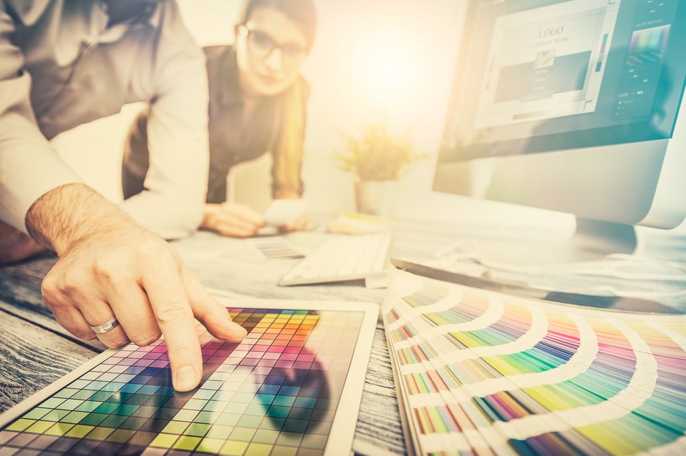
2018 is here and with the new year comes new ideas to impove your design work. Some of us might be searching for ways to reinvent or update our design whether it's a logo or photography. Maybe you are just looking for new trends to follow to stay current.
In graphic design, the trends come and go quickly. Luckily for you, we will divulge into some graphic design trends that you can look forward to in 2018.
With photography, you get the models that smile straight at the camera or force a hand shake. It all just seems forced lately. Not to say that this is necessarily bad but you do not want something that just feels unnatural. One of the trends this year is natural photos that tells a story. They are not staged, they are not forced and it's about living in the moment and capturing it.


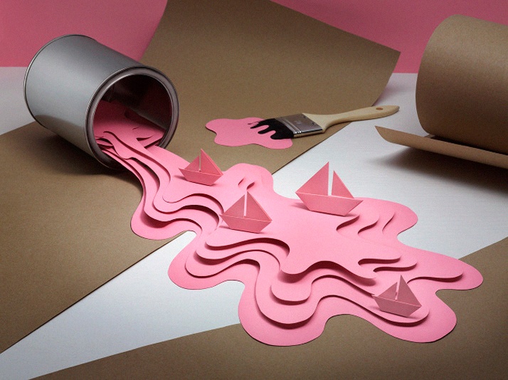
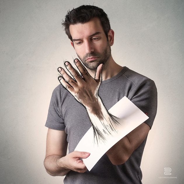
Graphic art is making a comeback in terms of design. Here is a couple great ideas to help your illustrations and graphic art take the next step in your design.
Digital art illustrations - Photography with art sketched on top - 3-D paper illustrations.
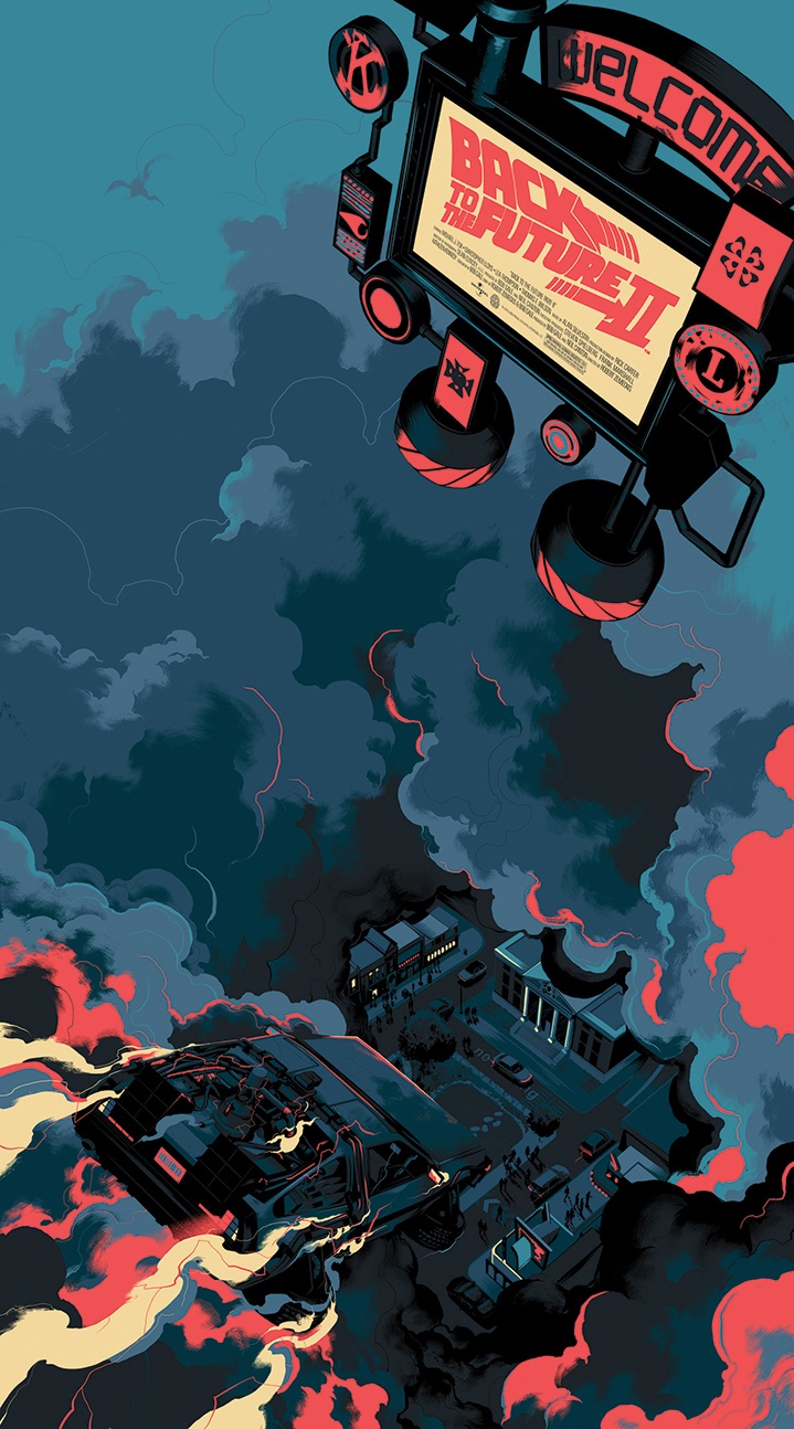
Photography is a very beautiful thing with the right treatment because it can change the feeling immediately. Here are a couple of pretty awesome ways to enhance your photos in a more creative manner.
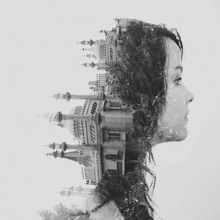
Gradient style - Duo tones made with halftone colors printed on top of each other. - Double exposure images
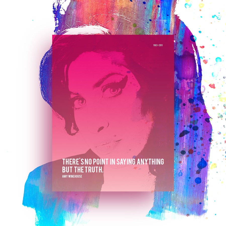
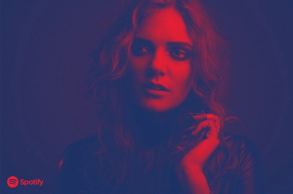
Typopgraphy is very expressive and with the right treatment it can make a very plain design absolutely stunning with the right treatment. Here is a couple different styles that you can use to push forward your type game.
Intermeshed with the design - Negative space typography - unconventional layout of letters and words
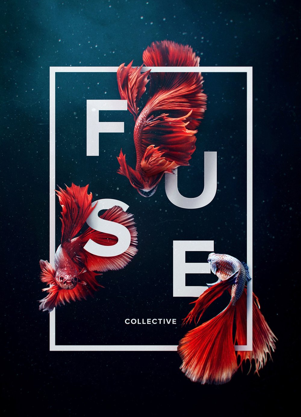
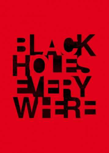
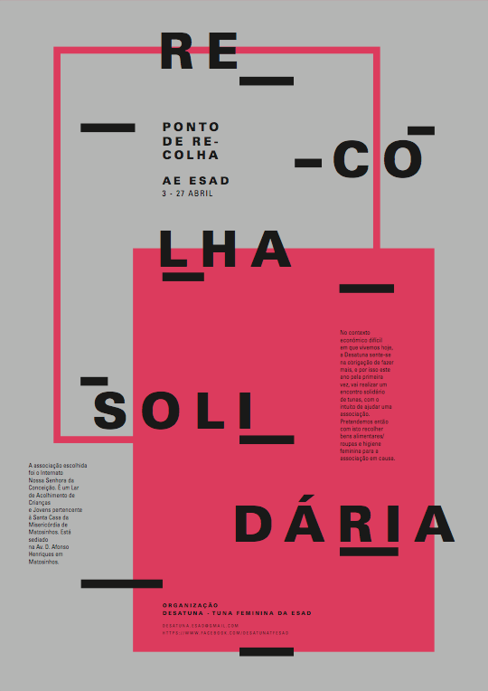
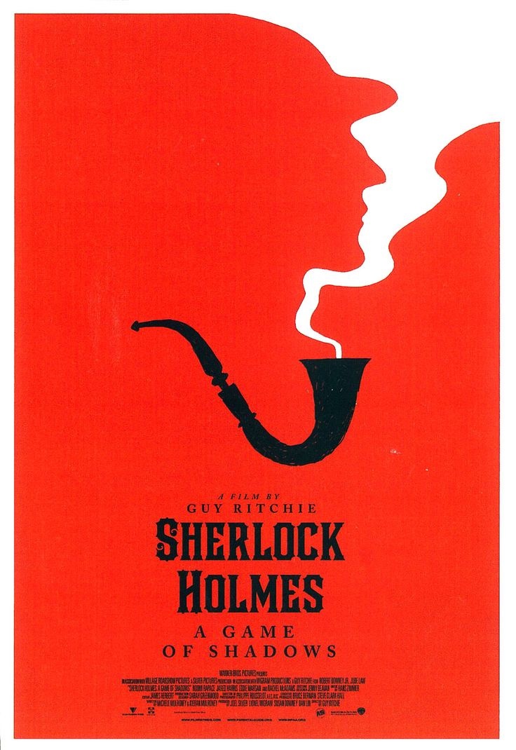
Negative space can be one of the most powerful when it comes to design. Personally, negative space can tell a story much better than a full loaded design or image. It leaves plenty to interpretion but it is also one of the most hated in design when it comes to clients.
Use of white images - using elements from the back coming to the front to create the design

In conlusion
Design trends are always fun to include in your design work especially when it's new, creative or innovative. However, don't stress over the new trends too much since there is always a chance your client might not be for it. These trends are not always going to be for everyone. Stick to what works for you and your client since you know your design style or their design style more than anyone.
Looking for a marketing and design agency? Contact us today for pricing details (951) 479-5411


Lorem Ipsum is a simple dummy text used as a dummy text contents. Lorem ipsum will be replaced. Lorem Ipsum is a simple dummy text used as a dummy text contents. Lorem ipsum will be replaced.Lorem Ipsum is a simple dummy text used as a dummy text contents. Lorem ipsum will be replaced.


